


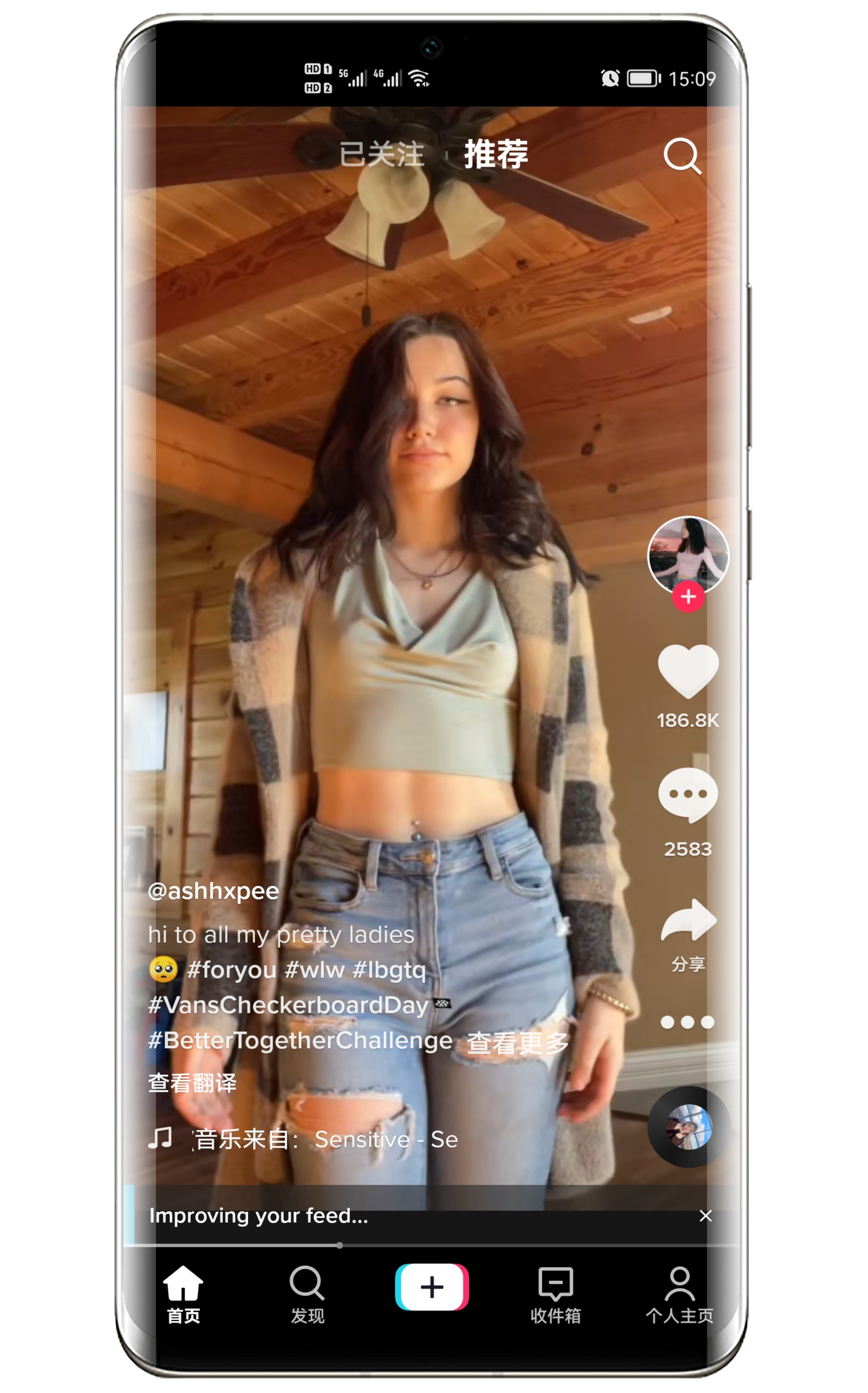
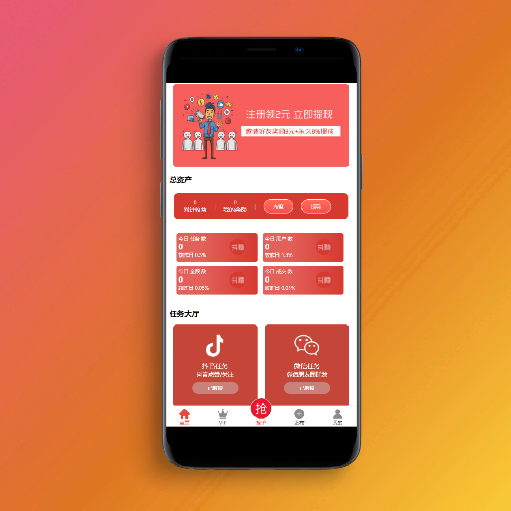
![图片[1]-粉色二次元个人主页源码-胖大海博客资源网](https://pdha.top/wp-content/uploads/pdha.top/2025/06/1748938638784.png)
HTML源码
<!DOCTYPE html><html lang="zh-CN"><head><meta charset="UTF-8"><meta name="viewport" content="width=device-width, initial-scale=1.0"><title>🌸 二次元粉色主页 🌸</title><style>* {margin: 0;padding: 0;box-sizing: border-box;}body {font-family: 'Microsoft YaHei', '微软雅黑', Arial, sans-serif;background: linear-gradient(135deg, rgba(255, 154, 158, 0.08) 0%, rgba(254, 207, 239, 0.08) 50%, rgba(254, 207, 239, 0.08) 100%);min-height: 100vh;overflow-x: hidden;position: relative;}/* 二次元动漫背景 */.anime-background {position: fixed;top: 0;left: 0;width: 100%;height: 100%;background-image: url('./1.png');background-size: cover;background-position: center;background-repeat: no-repeat;background-attachment: fixed;z-index: -3;filter: blur(0px);}/* 动漫背景装饰 */.anime-bg {position: fixed;top: 0;left: 0;width: 100%;height: 100%;background:radial-gradient(circle at 20% 80%, rgba(255, 192, 203, 0.02) 0%, transparent 50%),radial-gradient(circle at 80% 20%, rgba(255, 182, 193, 0.02) 0%, transparent 50%),radial-gradient(circle at 40% 40%, rgba(255, 105, 180, 0.01) 0%, transparent 30%);z-index: -2;}/* 樱花飘落动画 */.sakura {position: fixed;width: 20px;height: 20px;background: radial-gradient(circle, rgba(255, 183, 197, 0.25), rgba(255, 145, 164, 0.25));border-radius: 50% 0 50% 0;animation: fall linear infinite;z-index: -1;}@keyframes fall {0% {transform: translateY(-100vh) rotate(0deg);opacity: 1;}100% {transform: translateY(100vh) rotate(360deg);opacity: 0;}}/* 主容器 */.container {max-width: 1200px;margin: 0 auto;padding: 20px;position: relative;z-index: 1;}/* 头部区域 */.header {text-align: center;margin-bottom: 50px;background: linear-gradient(135deg, rgba(255, 255, 255, 0.12), rgba(255, 192, 203, 0.1));backdrop-filter: blur(45px);border-radius: 25px;padding: 40px 20px;box-shadow: 0 8px 32px rgba(255, 105, 180, 0.03);border: 2px solid rgba(255, 255, 255, 0.06);}.avatar {width: 120px;height: 120px;border-radius: 50%;margin: 0 auto 20px;background: linear-gradient(135deg, rgba(255, 154, 158, 0.1), rgba(250, 208, 196, 0.1));display: flex;align-items: center;justify-content: center;font-size: 48px;color: white;box-shadow: 0 8px 25px rgba(255, 105, 180, 0.05);position: relative;overflow: hidden;border: 3px solid rgba(255, 255, 255, 0.12);}.avatar img {width: 100%;height: 100%;border-radius: 50%;object-fit: cover;}.avatar::before {content: "";position: absolute;top: -50%;left: -50%;width: 200%;height: 200%;background: linear-gradient(45deg, transparent, rgba(255, 255, 255, 0.06), transparent);transform: rotate(45deg);animation: shine 3s ease-in-out infinite;z-index: 1;}@keyframes shine {0%, 100% { transform: translateX(-100%) translateY(-100%) rotate(45deg); }50% { transform: translateX(100%) translateY(100%) rotate(45deg); }}.name {font-size: 2.5em;color: #d63384;margin-bottom: 10px;font-weight: bold;}.qq-info {font-size: 1em;color: #8e44ad;margin-bottom: 10px;opacity: 1;font-weight: 500;}.description {font-size: 1.2em;color: #8e44ad;margin-bottom: 20px;}/* 导航菜单 */.nav-menu {display: flex;justify-content: center;gap: 20px;flex-wrap: wrap;margin-top: 30px;}.nav-item {background: linear-gradient(135deg, rgba(255, 154, 158, 0.12), rgba(254, 207, 239, 0.12));padding: 12px 25px;border-radius: 50px;text-decoration: none;color: white;font-weight: bold;transition: all 0.3s ease;box-shadow: 0 4px 15px rgba(255, 105, 180, 0.03);border: 2px solid rgba(255, 255, 255, 0.06);backdrop-filter: blur(35px);}.nav-item:hover {transform: translateY(-3px);box-shadow: 0 8px 25px rgba(255, 105, 180, 0.08);background: linear-gradient(135deg, rgba(254, 207, 239, 0.2), rgba(255, 154, 158, 0.2));}/* 内容区域 */.content {display: grid;grid-template-columns: repeat(auto-fit, minmax(350px, 1fr));gap: 30px;margin-bottom: 50px;}.card {background: linear-gradient(135deg, rgba(255, 255, 255, 0.12), rgba(255, 240, 245, 0.12));backdrop-filter: blur(45px);border-radius: 20px;padding: 30px;box-shadow: 0 8px 32px rgba(255, 105, 180, 0.03);border: 2px solid rgba(255, 255, 255, 0.06);transition: all 0.3s ease;}.card:hover {transform: translateY(-5px);box-shadow: 0 15px 40px rgba(255, 105, 180, 0.06);background: linear-gradient(135deg, rgba(255, 255, 255, 0.18), rgba(255, 240, 245, 0.18));}.card-title {font-size: 1.5em;color: #d63384;margin-bottom: 15px;display: flex;align-items: center;gap: 10px;}.card-content {color: #666;line-height: 1.6;}/* 云服务器广告特殊样式 */.ad-card {background: linear-gradient(135deg, rgba(255, 107, 107, 0.2), rgba(238, 90, 36, 0.2), rgba(255, 159, 243, 0.2));color: white;border: 3px solid rgba(255, 255, 255, 0.12);position: relative;overflow: hidden;backdrop-filter: blur(40px);}.ad-card::before {content: "🔥 热门推荐";position: absolute;top: -5px;right: -30px;background: rgba(255, 56, 56, 0.25);color: white;padding: 5px 40px;transform: rotate(45deg);font-size: 12px;font-weight: bold;backdrop-filter: blur(10px);}.ad-card .card-title {color: white;font-size: 1.8em;}.ad-card .card-content {color: rgba(255, 255, 255, 0.95);}.ad-button {display: inline-block;background: linear-gradient(135deg, rgba(255, 255, 255, 0.3), rgba(248, 249, 250, 0.3));color: #ff6b6b;padding: 15px 30px;border-radius: 50px;text-decoration: none;font-weight: bold;margin-top: 20px;transition: all 0.3s ease;box-shadow: 0 4px 15px rgba(0, 0, 0, 0.02);backdrop-filter: blur(35px);}.ad-button:hover {transform: scale(1.05);box-shadow: 0 8px 25px rgba(0, 0, 0, 0.05);background: linear-gradient(135deg, rgba(255, 255, 255, 0.5), rgba(248, 249, 250, 0.5));}/* 社交链接 */.social-links {display: flex;justify-content: center;gap: 20px;margin: 40px 0;}.social-link {width: 60px;height: 60px;border-radius: 50%;background: linear-gradient(135deg, rgba(255, 154, 158, 0.12), rgba(254, 207, 239, 0.12));display: flex;align-items: center;justify-content: center;text-decoration: none;color: white;font-size: 24px;transition: all 0.3s ease;box-shadow: 0 4px 15px rgba(255, 105, 180, 0.03);backdrop-filter: blur(35px);border: 2px solid rgba(255, 255, 255, 0.06);}.social-link:hover {transform: translateY(-3px) scale(1.1);box-shadow: 0 8px 25px rgba(255, 105, 180, 0.08);background: linear-gradient(135deg, rgba(255, 154, 158, 0.2), rgba(254, 207, 239, 0.2));}/* 页脚 */.footer {text-align: center;padding: 30px;background: linear-gradient(135deg, rgba(255, 255, 255, 0.12), rgba(255, 192, 203, 0.1));backdrop-filter: blur(45px);border-radius: 20px;color: #8e44ad;box-shadow: 0 8px 32px rgba(255, 105, 180, 0.03);border: 2px solid rgba(255, 255, 255, 0.06);}/* 响应式设计 */@media (max-width: 768px) {.container {padding: 10px;}.content {grid-template-columns: 1fr;}.nav-menu {flex-direction: column;align-items: center;}.name {font-size: 2em;}}/* 浮动心形装饰 */.heart {position: fixed;color: #ff69b4;font-size: 20px;animation: float 6s ease-in-out infinite;z-index: -1;}@keyframes float {0%, 100% { transform: translateY(0px) rotate(0deg); }25% { transform: translateY(-20px) rotate(5deg); }75% { transform: translateY(-10px) rotate(-5deg); }}/* 加载动画 */.loading {display: inline-block;width: 20px;height: 20px;border: 3px solid rgba(255, 105, 180, 0.3);border-radius: 50%;border-top-color: #ff69b4;animation: spin 1s ease-in-out infinite;}@keyframes spin {to { transform: rotate(360deg); }}</style></head><body><!-- 二次元动漫背景 --><div class="anime-background"></div><!-- 动漫背景装饰 --><div class="anime-bg"></div><!-- 主容器 --><div class="container"><!-- 头部区域 --><header class="header"><div class="avatar" id="avatar"><div class="loading"></div></div><h1 class="name" id="nickname">a'ゞ 胖大海</h1><p class="qq-info" id="qq-info">QQ: <span id="qq-number">941093035</span></p><p class="description">✨ 欢迎来到我的二次元粉色世界 ✨</p><nav class="nav-menu"><a href="#about" class="nav-item">🎀 关于我</a><a href="#portfolio" class="nav-item">🎨 作品集</a><a href="#contact" class="nav-item">💌 联系我</a><a href="#server" class="nav-item">☁️ 云服务</a></nav></header><!-- 内容区域 --><main class="content"><!-- 关于我 --><section id="about" class="card"><h2 class="card-title">🎀 关于我</h2><div class="card-content"><p>大家好!我是一个热爱二次元文化的小萌新~ 喜欢粉色、动漫、游戏和一切可爱的东西!</p><br><p>🌟 兴趣爱好:看番、画画、编程、游戏</p><p>💖 最爱颜色:粉色系</p><p>🎵 喜欢音乐:ACG音乐、J-POP</p><p>🎮 常玩游戏:原神、明日方舟、碧蓝档案</p></div></section><!-- 我的技能 --><section class="card"><h2 class="card-title">✨ 我的技能</h2><div class="card-content"><p>🎨 <strong>设计技能:</strong> Photoshop, Illustrator, Figma</p><br><p>💻 <strong>编程语言:</strong> HTML, CSS, JavaScript, Python</p><br><p>🎮 <strong>游戏技能:</strong> 原神、明日方舟、碧蓝档案</p><br><p>🌸 <strong>其他特长:</strong> 二次元文化、动漫推荐、萌化一切</p></div></section><!-- 云服务器广告 --><!--<section id="server" class="card ad-card"><h2 class="card-title">☁️ 免备案SM大宽带云服务器</h2><div class="card-content"><p><strong>🚀 讯度云 - 您的云计算首选伙伴!</strong></p><br><p>✅ <strong>免备案:</strong>即买即用,无需繁琐备案流程</p><p>📡 <strong>大宽带:</strong>高速稳定,满足各种业务需求</p><p>🔒 <strong>安全可靠:</strong>7×24小时监控,数据安全有保障</p><p>💰 <strong>价格优惠:</strong>新用户享受特惠价格</p><br><p><em>无论是个人网站、企业应用还是游戏服务器,讯度云都能为您提供最优质的云计算服务!</em></p><a href="https://pdha.top/" target="_blank" class="ad-button">🌟 立即购买云服务器 🌟</a></div></section>--><!-- 最近动态 --><section class="card"><h2 class="card-title">📝 最近动态</h2><div class="card-content"><p>🎉 <strong>2024.01.15</strong> - 完成了新的个人主页设计!</p><br><p>🎨 <strong>2024.01.10</strong> - 学会了CSS动画制作</p><br><p>🎮 <strong>2024.01.05</strong> - 原神抽到了心海!好开心~</p><br><p>📚 <strong>2024.01.01</strong> - 新年快乐!今年要更加努力学习!</p></div></section><!-- 联系方式 --><section id="contact" class="card"><h2 class="card-title">💌 联系我</h2><div class="card-content"><p>想要和我交流二次元话题或者技术问题吗?欢迎通过以下方式联系我:</p><br><p>📧 邮箱:example@email.com</p><p>💬 QQ:<span id="contact-qq">941093035</span></p><p>🐦 微博:@微博</p><p>📱 微信:加好友请备注来源哦~</p></div></section><!-- 推荐番剧 --><section class="card"><h2 class="card-title">🎬 推荐番剧</h2><div class="card-content"><p>🌸 <strong>春季必看:</strong>《樱花庄的宠物女孩》</p><br><p>💖 <strong>治愈系:</strong>《K-ON!》轻音部</p><br><p>⚔️ <strong>战斗番:</strong>《鬼灭之刃》</p><br><p>🎭 <strong>日常番:</strong>《小林家的龙女仆》</p></div></section></main><!-- 社交链接 --><div class="social-links"><a href="https://pdha.top/" target="_blank" class="social-link" title="123">Q</a><a href="https://pdha.top/" target="_blank" class="social-link" title="123">💬</a><a href="https://pdha.top/" target="_blank" class="social-link" title="123">📱</a><a href="https://pdha.top/" target="_blank" class="social-link" title="123">📧</a></div><!-- 页脚 --><footer class="footer"><p>💖 Made with Love by <span id="footer-nickname">二次元小萌新</span> 💖</p><p>🌸 感谢您的访问,祝您每天都充满粉色的美好心情!🌸</p><br><p><small>Powered by 胖大海 | <a href="https://pdha.top/" target="_blank" style="color: #d63384;">博客</a></small></p></footer></div><script>// QQ号码配置const QQ_NUMBER = '941093035';const FIXED_NICKNAME = "a'ゞ PDHA.TOP";// 更新页面中的QQ号码function updateQQNumber() {document.getElementById('qq-number').textContent = QQ_NUMBER;document.getElementById('contact-qq').textContent = QQ_NUMBER;}// 直接设置用户信息,不使用接口function loadUserInfo() {// 设置固定昵称document.getElementById('nickname').textContent = FIXED_NICKNAME;document.getElementById('footer-nickname').textContent = FIXED_NICKNAME;// 加载高清头像const avatarImg = document.createElement('img');// 使用更高清的头像参数avatarImg.src = `https://q1.qlogo.cn/g?b=qq&nk=${QQ_NUMBER}&s=640&t=${Date.now()}`;avatarImg.alt = 'QQ头像';// 设置图片质量优化avatarImg.style.imageRendering = 'crisp-edges';avatarImg.style.imageRendering = '-webkit-optimize-contrast';avatarImg.onload = function() {document.getElementById('avatar').innerHTML = '';document.getElementById('avatar').appendChild(avatarImg);console.log('头像加载成功');};avatarImg.onerror = function() {// 尝试其他高清头像源this.src = `https://q2.qlogo.cn/headimg_dl?dst_uin=${QQ_NUMBER}&spec=640`;this.onerror = function() {// 最终备用方案this.src = `https://thirdqq.qlogo.cn/g?b=qq&nk=${QQ_NUMBER}&s=640`;this.onerror = function() {document.getElementById('avatar').innerHTML = '🌸';};};};}// 创建樱花飘落效果function createSakura() {for (let i = 0; i < 15; i++) {const sakura = document.createElement('div');sakura.className = 'sakura';sakura.style.left = Math.random() * 100 + 'vw';sakura.style.animationDuration = Math.random() * 3 + 2 + 's';sakura.style.animationDelay = Math.random() * 2 + 's';document.body.appendChild(sakura);// 5秒后移除元素setTimeout(() => {if (sakura.parentNode) {sakura.parentNode.removeChild(sakura);}}, 5000);}}// 创建浮动心形function createHearts() {const hearts = ['💖', '💕', '💗', '💓', '💝', '🌸', '🎀', '✨'];for (let i = 0; i < 6; i++) {const heart = document.createElement('div');heart.className = 'heart';heart.innerHTML = hearts[Math.floor(Math.random() * hearts.length)];heart.style.left = Math.random() * 100 + 'vw';heart.style.top = Math.random() * 100 + 'vh';heart.style.animationDelay = Math.random() * 6 + 's';document.body.appendChild(heart);}}// 页面加载完成后执行window.addEventListener('load', function() {updateQQNumber();loadUserInfo();createSakura();createHearts();// 每隔3秒创建新的樱花setInterval(createSakura, 3000);});// 平滑滚动到锚点document.querySelectorAll('a[href^="#"]').forEach(anchor => {anchor.addEventListener('click', function (e) {e.preventDefault();const target = document.querySelector(this.getAttribute('href'));if (target) {target.scrollIntoView({behavior: 'smooth',block: 'start'});}});});// 鼠标跟随效果document.addEventListener('mousemove', function(e) {if (Math.random() < 0.08) { // 8% 概率生成粒子const particles = ['✨', '💖', '🌸', '💕'];const particle = document.createElement('div');particle.innerHTML = particles[Math.floor(Math.random() * particles.length)];particle.style.position = 'fixed';particle.style.left = e.clientX + 'px';particle.style.top = e.clientY + 'px';particle.style.fontSize = '12px';particle.style.color = '#ff69b4';particle.style.pointerEvents = 'none';particle.style.zIndex = '9999';particle.style.animation = 'fadeOut 2s ease-out forwards';document.body.appendChild(particle);setTimeout(() => {if (particle.parentNode) {particle.parentNode.removeChild(particle);}}, 2000);}});// 添加淡出动画const style = document.createElement('style');style.textContent = `@keyframes fadeOut {0% { opacity: 1; transform: scale(1) translateY(0); }100% { opacity: 0; transform: scale(0.5) translateY(-20px); }}`;document.head.appendChild(style);</script></body></html><!DOCTYPE html> <html lang="zh-CN"> <head> <meta charset="UTF-8"> <meta name="viewport" content="width=device-width, initial-scale=1.0"> <title>🌸 二次元粉色主页 🌸</title> <style> * { margin: 0; padding: 0; box-sizing: border-box; } body { font-family: 'Microsoft YaHei', '微软雅黑', Arial, sans-serif; background: linear-gradient(135deg, rgba(255, 154, 158, 0.08) 0%, rgba(254, 207, 239, 0.08) 50%, rgba(254, 207, 239, 0.08) 100%); min-height: 100vh; overflow-x: hidden; position: relative; } /* 二次元动漫背景 */ .anime-background { position: fixed; top: 0; left: 0; width: 100%; height: 100%; background-image: url('./1.png'); background-size: cover; background-position: center; background-repeat: no-repeat; background-attachment: fixed; z-index: -3; filter: blur(0px); } /* 动漫背景装饰 */ .anime-bg { position: fixed; top: 0; left: 0; width: 100%; height: 100%; background: radial-gradient(circle at 20% 80%, rgba(255, 192, 203, 0.02) 0%, transparent 50%), radial-gradient(circle at 80% 20%, rgba(255, 182, 193, 0.02) 0%, transparent 50%), radial-gradient(circle at 40% 40%, rgba(255, 105, 180, 0.01) 0%, transparent 30%); z-index: -2; } /* 樱花飘落动画 */ .sakura { position: fixed; width: 20px; height: 20px; background: radial-gradient(circle, rgba(255, 183, 197, 0.25), rgba(255, 145, 164, 0.25)); border-radius: 50% 0 50% 0; animation: fall linear infinite; z-index: -1; } @keyframes fall { 0% { transform: translateY(-100vh) rotate(0deg); opacity: 1; } 100% { transform: translateY(100vh) rotate(360deg); opacity: 0; } } /* 主容器 */ .container { max-width: 1200px; margin: 0 auto; padding: 20px; position: relative; z-index: 1; } /* 头部区域 */ .header { text-align: center; margin-bottom: 50px; background: linear-gradient(135deg, rgba(255, 255, 255, 0.12), rgba(255, 192, 203, 0.1)); backdrop-filter: blur(45px); border-radius: 25px; padding: 40px 20px; box-shadow: 0 8px 32px rgba(255, 105, 180, 0.03); border: 2px solid rgba(255, 255, 255, 0.06); } .avatar { width: 120px; height: 120px; border-radius: 50%; margin: 0 auto 20px; background: linear-gradient(135deg, rgba(255, 154, 158, 0.1), rgba(250, 208, 196, 0.1)); display: flex; align-items: center; justify-content: center; font-size: 48px; color: white; box-shadow: 0 8px 25px rgba(255, 105, 180, 0.05); position: relative; overflow: hidden; border: 3px solid rgba(255, 255, 255, 0.12); } .avatar img { width: 100%; height: 100%; border-radius: 50%; object-fit: cover; } .avatar::before { content: ""; position: absolute; top: -50%; left: -50%; width: 200%; height: 200%; background: linear-gradient(45deg, transparent, rgba(255, 255, 255, 0.06), transparent); transform: rotate(45deg); animation: shine 3s ease-in-out infinite; z-index: 1; } @keyframes shine { 0%, 100% { transform: translateX(-100%) translateY(-100%) rotate(45deg); } 50% { transform: translateX(100%) translateY(100%) rotate(45deg); } } .name { font-size: 2.5em; color: #d63384; margin-bottom: 10px; font-weight: bold; } .qq-info { font-size: 1em; color: #8e44ad; margin-bottom: 10px; opacity: 1; font-weight: 500; } .description { font-size: 1.2em; color: #8e44ad; margin-bottom: 20px; } /* 导航菜单 */ .nav-menu { display: flex; justify-content: center; gap: 20px; flex-wrap: wrap; margin-top: 30px; } .nav-item { background: linear-gradient(135deg, rgba(255, 154, 158, 0.12), rgba(254, 207, 239, 0.12)); padding: 12px 25px; border-radius: 50px; text-decoration: none; color: white; font-weight: bold; transition: all 0.3s ease; box-shadow: 0 4px 15px rgba(255, 105, 180, 0.03); border: 2px solid rgba(255, 255, 255, 0.06); backdrop-filter: blur(35px); } .nav-item:hover { transform: translateY(-3px); box-shadow: 0 8px 25px rgba(255, 105, 180, 0.08); background: linear-gradient(135deg, rgba(254, 207, 239, 0.2), rgba(255, 154, 158, 0.2)); } /* 内容区域 */ .content { display: grid; grid-template-columns: repeat(auto-fit, minmax(350px, 1fr)); gap: 30px; margin-bottom: 50px; } .card { background: linear-gradient(135deg, rgba(255, 255, 255, 0.12), rgba(255, 240, 245, 0.12)); backdrop-filter: blur(45px); border-radius: 20px; padding: 30px; box-shadow: 0 8px 32px rgba(255, 105, 180, 0.03); border: 2px solid rgba(255, 255, 255, 0.06); transition: all 0.3s ease; } .card:hover { transform: translateY(-5px); box-shadow: 0 15px 40px rgba(255, 105, 180, 0.06); background: linear-gradient(135deg, rgba(255, 255, 255, 0.18), rgba(255, 240, 245, 0.18)); } .card-title { font-size: 1.5em; color: #d63384; margin-bottom: 15px; display: flex; align-items: center; gap: 10px; } .card-content { color: #666; line-height: 1.6; } /* 云服务器广告特殊样式 */ .ad-card { background: linear-gradient(135deg, rgba(255, 107, 107, 0.2), rgba(238, 90, 36, 0.2), rgba(255, 159, 243, 0.2)); color: white; border: 3px solid rgba(255, 255, 255, 0.12); position: relative; overflow: hidden; backdrop-filter: blur(40px); } .ad-card::before { content: "🔥 热门推荐"; position: absolute; top: -5px; right: -30px; background: rgba(255, 56, 56, 0.25); color: white; padding: 5px 40px; transform: rotate(45deg); font-size: 12px; font-weight: bold; backdrop-filter: blur(10px); } .ad-card .card-title { color: white; font-size: 1.8em; } .ad-card .card-content { color: rgba(255, 255, 255, 0.95); } .ad-button { display: inline-block; background: linear-gradient(135deg, rgba(255, 255, 255, 0.3), rgba(248, 249, 250, 0.3)); color: #ff6b6b; padding: 15px 30px; border-radius: 50px; text-decoration: none; font-weight: bold; margin-top: 20px; transition: all 0.3s ease; box-shadow: 0 4px 15px rgba(0, 0, 0, 0.02); backdrop-filter: blur(35px); } .ad-button:hover { transform: scale(1.05); box-shadow: 0 8px 25px rgba(0, 0, 0, 0.05); background: linear-gradient(135deg, rgba(255, 255, 255, 0.5), rgba(248, 249, 250, 0.5)); } /* 社交链接 */ .social-links { display: flex; justify-content: center; gap: 20px; margin: 40px 0; } .social-link { width: 60px; height: 60px; border-radius: 50%; background: linear-gradient(135deg, rgba(255, 154, 158, 0.12), rgba(254, 207, 239, 0.12)); display: flex; align-items: center; justify-content: center; text-decoration: none; color: white; font-size: 24px; transition: all 0.3s ease; box-shadow: 0 4px 15px rgba(255, 105, 180, 0.03); backdrop-filter: blur(35px); border: 2px solid rgba(255, 255, 255, 0.06); } .social-link:hover { transform: translateY(-3px) scale(1.1); box-shadow: 0 8px 25px rgba(255, 105, 180, 0.08); background: linear-gradient(135deg, rgba(255, 154, 158, 0.2), rgba(254, 207, 239, 0.2)); } /* 页脚 */ .footer { text-align: center; padding: 30px; background: linear-gradient(135deg, rgba(255, 255, 255, 0.12), rgba(255, 192, 203, 0.1)); backdrop-filter: blur(45px); border-radius: 20px; color: #8e44ad; box-shadow: 0 8px 32px rgba(255, 105, 180, 0.03); border: 2px solid rgba(255, 255, 255, 0.06); } /* 响应式设计 */ @media (max-width: 768px) { .container { padding: 10px; } .content { grid-template-columns: 1fr; } .nav-menu { flex-direction: column; align-items: center; } .name { font-size: 2em; } } /* 浮动心形装饰 */ .heart { position: fixed; color: #ff69b4; font-size: 20px; animation: float 6s ease-in-out infinite; z-index: -1; } @keyframes float { 0%, 100% { transform: translateY(0px) rotate(0deg); } 25% { transform: translateY(-20px) rotate(5deg); } 75% { transform: translateY(-10px) rotate(-5deg); } } /* 加载动画 */ .loading { display: inline-block; width: 20px; height: 20px; border: 3px solid rgba(255, 105, 180, 0.3); border-radius: 50%; border-top-color: #ff69b4; animation: spin 1s ease-in-out infinite; } @keyframes spin { to { transform: rotate(360deg); } } </style> </head> <body> <!-- 二次元动漫背景 --> <div class="anime-background"></div> <!-- 动漫背景装饰 --> <div class="anime-bg"></div> <!-- 主容器 --> <div class="container"> <!-- 头部区域 --> <header class="header"> <div class="avatar" id="avatar"> <div class="loading"></div> </div> <h1 class="name" id="nickname">a'ゞ 胖大海</h1> <p class="qq-info" id="qq-info">QQ: <span id="qq-number">941093035</span></p> <p class="description">✨ 欢迎来到我的二次元粉色世界 ✨</p> <nav class="nav-menu"> <a href="#about" class="nav-item">🎀 关于我</a> <a href="#portfolio" class="nav-item">🎨 作品集</a> <a href="#contact" class="nav-item">💌 联系我</a> <a href="#server" class="nav-item">☁️ 云服务</a> </nav> </header> <!-- 内容区域 --> <main class="content"> <!-- 关于我 --> <section id="about" class="card"> <h2 class="card-title">🎀 关于我</h2> <div class="card-content"> <p>大家好!我是一个热爱二次元文化的小萌新~ 喜欢粉色、动漫、游戏和一切可爱的东西!</p> <br> <p>🌟 兴趣爱好:看番、画画、编程、游戏</p> <p>💖 最爱颜色:粉色系</p> <p>🎵 喜欢音乐:ACG音乐、J-POP</p> <p>🎮 常玩游戏:原神、明日方舟、碧蓝档案</p> </div> </section> <!-- 我的技能 --> <section class="card"> <h2 class="card-title">✨ 我的技能</h2> <div class="card-content"> <p>🎨 <strong>设计技能:</strong> Photoshop, Illustrator, Figma</p> <br> <p>💻 <strong>编程语言:</strong> HTML, CSS, JavaScript, Python</p> <br> <p>🎮 <strong>游戏技能:</strong> 原神、明日方舟、碧蓝档案</p> <br> <p>🌸 <strong>其他特长:</strong> 二次元文化、动漫推荐、萌化一切</p> </div> </section> <!-- 云服务器广告 --> <!--<section id="server" class="card ad-card"> <h2 class="card-title">☁️ 免备案SM大宽带云服务器</h2> <div class="card-content"> <p><strong>🚀 讯度云 - 您的云计算首选伙伴!</strong></p> <br> <p>✅ <strong>免备案:</strong>即买即用,无需繁琐备案流程</p> <p>📡 <strong>大宽带:</strong>高速稳定,满足各种业务需求</p> <p>🔒 <strong>安全可靠:</strong>7×24小时监控,数据安全有保障</p> <p>💰 <strong>价格优惠:</strong>新用户享受特惠价格</p> <br> <p><em>无论是个人网站、企业应用还是游戏服务器,讯度云都能为您提供最优质的云计算服务!</em></p> <a href="https://pdha.top/" target="_blank" class="ad-button"> 🌟 立即购买云服务器 🌟 </a> </div> </section>--> <!-- 最近动态 --> <section class="card"> <h2 class="card-title">📝 最近动态</h2> <div class="card-content"> <p>🎉 <strong>2024.01.15</strong> - 完成了新的个人主页设计!</p> <br> <p>🎨 <strong>2024.01.10</strong> - 学会了CSS动画制作</p> <br> <p>🎮 <strong>2024.01.05</strong> - 原神抽到了心海!好开心~</p> <br> <p>📚 <strong>2024.01.01</strong> - 新年快乐!今年要更加努力学习!</p> </div> </section> <!-- 联系方式 --> <section id="contact" class="card"> <h2 class="card-title">💌 联系我</h2> <div class="card-content"> <p>想要和我交流二次元话题或者技术问题吗?欢迎通过以下方式联系我:</p> <br> <p>📧 邮箱:example@email.com</p> <p>💬 QQ:<span id="contact-qq">941093035</span></p> <p>🐦 微博:@微博</p> <p>📱 微信:加好友请备注来源哦~</p> </div> </section> <!-- 推荐番剧 --> <section class="card"> <h2 class="card-title">🎬 推荐番剧</h2> <div class="card-content"> <p>🌸 <strong>春季必看:</strong>《樱花庄的宠物女孩》</p> <br> <p>💖 <strong>治愈系:</strong>《K-ON!》轻音部</p> <br> <p>⚔️ <strong>战斗番:</strong>《鬼灭之刃》</p> <br> <p>🎭 <strong>日常番:</strong>《小林家的龙女仆》</p> </div> </section> </main> <!-- 社交链接 --> <div class="social-links"> <a href="https://pdha.top/" target="_blank" class="social-link" title="123">Q</a> <a href="https://pdha.top/" target="_blank" class="social-link" title="123">💬</a> <a href="https://pdha.top/" target="_blank" class="social-link" title="123">📱</a> <a href="https://pdha.top/" target="_blank" class="social-link" title="123">📧</a> </div> <!-- 页脚 --> <footer class="footer"> <p>💖 Made with Love by <span id="footer-nickname">二次元小萌新</span> 💖</p> <p>🌸 感谢您的访问,祝您每天都充满粉色的美好心情!🌸</p> <br> <p><small>Powered by 胖大海 | <a href="https://pdha.top/" target="_blank" style="color: #d63384;">博客</a></small></p> </footer> </div> <script> // QQ号码配置 const QQ_NUMBER = '941093035'; const FIXED_NICKNAME = "a'ゞ PDHA.TOP"; // 更新页面中的QQ号码 function updateQQNumber() { document.getElementById('qq-number').textContent = QQ_NUMBER; document.getElementById('contact-qq').textContent = QQ_NUMBER; } // 直接设置用户信息,不使用接口 function loadUserInfo() { // 设置固定昵称 document.getElementById('nickname').textContent = FIXED_NICKNAME; document.getElementById('footer-nickname').textContent = FIXED_NICKNAME; // 加载高清头像 const avatarImg = document.createElement('img'); // 使用更高清的头像参数 avatarImg.src = `https://q1.qlogo.cn/g?b=qq&nk=${QQ_NUMBER}&s=640&t=${Date.now()}`; avatarImg.alt = 'QQ头像'; // 设置图片质量优化 avatarImg.style.imageRendering = 'crisp-edges'; avatarImg.style.imageRendering = '-webkit-optimize-contrast'; avatarImg.onload = function() { document.getElementById('avatar').innerHTML = ''; document.getElementById('avatar').appendChild(avatarImg); console.log('头像加载成功'); }; avatarImg.onerror = function() { // 尝试其他高清头像源 this.src = `https://q2.qlogo.cn/headimg_dl?dst_uin=${QQ_NUMBER}&spec=640`; this.onerror = function() { // 最终备用方案 this.src = `https://thirdqq.qlogo.cn/g?b=qq&nk=${QQ_NUMBER}&s=640`; this.onerror = function() { document.getElementById('avatar').innerHTML = '🌸'; }; }; }; } // 创建樱花飘落效果 function createSakura() { for (let i = 0; i < 15; i++) { const sakura = document.createElement('div'); sakura.className = 'sakura'; sakura.style.left = Math.random() * 100 + 'vw'; sakura.style.animationDuration = Math.random() * 3 + 2 + 's'; sakura.style.animationDelay = Math.random() * 2 + 's'; document.body.appendChild(sakura); // 5秒后移除元素 setTimeout(() => { if (sakura.parentNode) { sakura.parentNode.removeChild(sakura); } }, 5000); } } // 创建浮动心形 function createHearts() { const hearts = ['💖', '💕', '💗', '💓', '💝', '🌸', '🎀', '✨']; for (let i = 0; i < 6; i++) { const heart = document.createElement('div'); heart.className = 'heart'; heart.innerHTML = hearts[Math.floor(Math.random() * hearts.length)]; heart.style.left = Math.random() * 100 + 'vw'; heart.style.top = Math.random() * 100 + 'vh'; heart.style.animationDelay = Math.random() * 6 + 's'; document.body.appendChild(heart); } } // 页面加载完成后执行 window.addEventListener('load', function() { updateQQNumber(); loadUserInfo(); createSakura(); createHearts(); // 每隔3秒创建新的樱花 setInterval(createSakura, 3000); }); // 平滑滚动到锚点 document.querySelectorAll('a[href^="#"]').forEach(anchor => { anchor.addEventListener('click', function (e) { e.preventDefault(); const target = document.querySelector(this.getAttribute('href')); if (target) { target.scrollIntoView({ behavior: 'smooth', block: 'start' }); } }); }); // 鼠标跟随效果 document.addEventListener('mousemove', function(e) { if (Math.random() < 0.08) { // 8% 概率生成粒子 const particles = ['✨', '💖', '🌸', '💕']; const particle = document.createElement('div'); particle.innerHTML = particles[Math.floor(Math.random() * particles.length)]; particle.style.position = 'fixed'; particle.style.left = e.clientX + 'px'; particle.style.top = e.clientY + 'px'; particle.style.fontSize = '12px'; particle.style.color = '#ff69b4'; particle.style.pointerEvents = 'none'; particle.style.zIndex = '9999'; particle.style.animation = 'fadeOut 2s ease-out forwards'; document.body.appendChild(particle); setTimeout(() => { if (particle.parentNode) { particle.parentNode.removeChild(particle); } }, 2000); } }); // 添加淡出动画 const style = document.createElement('style'); style.textContent = ` @keyframes fadeOut { 0% { opacity: 1; transform: scale(1) translateY(0); } 100% { opacity: 0; transform: scale(0.5) translateY(-20px); } } `; document.head.appendChild(style); </script> </body> </html><!DOCTYPE html> <html lang="zh-CN"> <head> <meta charset="UTF-8"> <meta name="viewport" content="width=device-width, initial-scale=1.0"> <title>🌸 二次元粉色主页 🌸</title> <style> * { margin: 0; padding: 0; box-sizing: border-box; } body { font-family: 'Microsoft YaHei', '微软雅黑', Arial, sans-serif; background: linear-gradient(135deg, rgba(255, 154, 158, 0.08) 0%, rgba(254, 207, 239, 0.08) 50%, rgba(254, 207, 239, 0.08) 100%); min-height: 100vh; overflow-x: hidden; position: relative; } /* 二次元动漫背景 */ .anime-background { position: fixed; top: 0; left: 0; width: 100%; height: 100%; background-image: url('./1.png'); background-size: cover; background-position: center; background-repeat: no-repeat; background-attachment: fixed; z-index: -3; filter: blur(0px); } /* 动漫背景装饰 */ .anime-bg { position: fixed; top: 0; left: 0; width: 100%; height: 100%; background: radial-gradient(circle at 20% 80%, rgba(255, 192, 203, 0.02) 0%, transparent 50%), radial-gradient(circle at 80% 20%, rgba(255, 182, 193, 0.02) 0%, transparent 50%), radial-gradient(circle at 40% 40%, rgba(255, 105, 180, 0.01) 0%, transparent 30%); z-index: -2; } /* 樱花飘落动画 */ .sakura { position: fixed; width: 20px; height: 20px; background: radial-gradient(circle, rgba(255, 183, 197, 0.25), rgba(255, 145, 164, 0.25)); border-radius: 50% 0 50% 0; animation: fall linear infinite; z-index: -1; } @keyframes fall { 0% { transform: translateY(-100vh) rotate(0deg); opacity: 1; } 100% { transform: translateY(100vh) rotate(360deg); opacity: 0; } } /* 主容器 */ .container { max-width: 1200px; margin: 0 auto; padding: 20px; position: relative; z-index: 1; } /* 头部区域 */ .header { text-align: center; margin-bottom: 50px; background: linear-gradient(135deg, rgba(255, 255, 255, 0.12), rgba(255, 192, 203, 0.1)); backdrop-filter: blur(45px); border-radius: 25px; padding: 40px 20px; box-shadow: 0 8px 32px rgba(255, 105, 180, 0.03); border: 2px solid rgba(255, 255, 255, 0.06); } .avatar { width: 120px; height: 120px; border-radius: 50%; margin: 0 auto 20px; background: linear-gradient(135deg, rgba(255, 154, 158, 0.1), rgba(250, 208, 196, 0.1)); display: flex; align-items: center; justify-content: center; font-size: 48px; color: white; box-shadow: 0 8px 25px rgba(255, 105, 180, 0.05); position: relative; overflow: hidden; border: 3px solid rgba(255, 255, 255, 0.12); } .avatar img { width: 100%; height: 100%; border-radius: 50%; object-fit: cover; } .avatar::before { content: ""; position: absolute; top: -50%; left: -50%; width: 200%; height: 200%; background: linear-gradient(45deg, transparent, rgba(255, 255, 255, 0.06), transparent); transform: rotate(45deg); animation: shine 3s ease-in-out infinite; z-index: 1; } @keyframes shine { 0%, 100% { transform: translateX(-100%) translateY(-100%) rotate(45deg); } 50% { transform: translateX(100%) translateY(100%) rotate(45deg); } } .name { font-size: 2.5em; color: #d63384; margin-bottom: 10px; font-weight: bold; } .qq-info { font-size: 1em; color: #8e44ad; margin-bottom: 10px; opacity: 1; font-weight: 500; } .description { font-size: 1.2em; color: #8e44ad; margin-bottom: 20px; } /* 导航菜单 */ .nav-menu { display: flex; justify-content: center; gap: 20px; flex-wrap: wrap; margin-top: 30px; } .nav-item { background: linear-gradient(135deg, rgba(255, 154, 158, 0.12), rgba(254, 207, 239, 0.12)); padding: 12px 25px; border-radius: 50px; text-decoration: none; color: white; font-weight: bold; transition: all 0.3s ease; box-shadow: 0 4px 15px rgba(255, 105, 180, 0.03); border: 2px solid rgba(255, 255, 255, 0.06); backdrop-filter: blur(35px); } .nav-item:hover { transform: translateY(-3px); box-shadow: 0 8px 25px rgba(255, 105, 180, 0.08); background: linear-gradient(135deg, rgba(254, 207, 239, 0.2), rgba(255, 154, 158, 0.2)); } /* 内容区域 */ .content { display: grid; grid-template-columns: repeat(auto-fit, minmax(350px, 1fr)); gap: 30px; margin-bottom: 50px; } .card { background: linear-gradient(135deg, rgba(255, 255, 255, 0.12), rgba(255, 240, 245, 0.12)); backdrop-filter: blur(45px); border-radius: 20px; padding: 30px; box-shadow: 0 8px 32px rgba(255, 105, 180, 0.03); border: 2px solid rgba(255, 255, 255, 0.06); transition: all 0.3s ease; } .card:hover { transform: translateY(-5px); box-shadow: 0 15px 40px rgba(255, 105, 180, 0.06); background: linear-gradient(135deg, rgba(255, 255, 255, 0.18), rgba(255, 240, 245, 0.18)); } .card-title { font-size: 1.5em; color: #d63384; margin-bottom: 15px; display: flex; align-items: center; gap: 10px; } .card-content { color: #666; line-height: 1.6; } /* 云服务器广告特殊样式 */ .ad-card { background: linear-gradient(135deg, rgba(255, 107, 107, 0.2), rgba(238, 90, 36, 0.2), rgba(255, 159, 243, 0.2)); color: white; border: 3px solid rgba(255, 255, 255, 0.12); position: relative; overflow: hidden; backdrop-filter: blur(40px); } .ad-card::before { content: "🔥 热门推荐"; position: absolute; top: -5px; right: -30px; background: rgba(255, 56, 56, 0.25); color: white; padding: 5px 40px; transform: rotate(45deg); font-size: 12px; font-weight: bold; backdrop-filter: blur(10px); } .ad-card .card-title { color: white; font-size: 1.8em; } .ad-card .card-content { color: rgba(255, 255, 255, 0.95); } .ad-button { display: inline-block; background: linear-gradient(135deg, rgba(255, 255, 255, 0.3), rgba(248, 249, 250, 0.3)); color: #ff6b6b; padding: 15px 30px; border-radius: 50px; text-decoration: none; font-weight: bold; margin-top: 20px; transition: all 0.3s ease; box-shadow: 0 4px 15px rgba(0, 0, 0, 0.02); backdrop-filter: blur(35px); } .ad-button:hover { transform: scale(1.05); box-shadow: 0 8px 25px rgba(0, 0, 0, 0.05); background: linear-gradient(135deg, rgba(255, 255, 255, 0.5), rgba(248, 249, 250, 0.5)); } /* 社交链接 */ .social-links { display: flex; justify-content: center; gap: 20px; margin: 40px 0; } .social-link { width: 60px; height: 60px; border-radius: 50%; background: linear-gradient(135deg, rgba(255, 154, 158, 0.12), rgba(254, 207, 239, 0.12)); display: flex; align-items: center; justify-content: center; text-decoration: none; color: white; font-size: 24px; transition: all 0.3s ease; box-shadow: 0 4px 15px rgba(255, 105, 180, 0.03); backdrop-filter: blur(35px); border: 2px solid rgba(255, 255, 255, 0.06); } .social-link:hover { transform: translateY(-3px) scale(1.1); box-shadow: 0 8px 25px rgba(255, 105, 180, 0.08); background: linear-gradient(135deg, rgba(255, 154, 158, 0.2), rgba(254, 207, 239, 0.2)); } /* 页脚 */ .footer { text-align: center; padding: 30px; background: linear-gradient(135deg, rgba(255, 255, 255, 0.12), rgba(255, 192, 203, 0.1)); backdrop-filter: blur(45px); border-radius: 20px; color: #8e44ad; box-shadow: 0 8px 32px rgba(255, 105, 180, 0.03); border: 2px solid rgba(255, 255, 255, 0.06); } /* 响应式设计 */ @media (max-width: 768px) { .container { padding: 10px; } .content { grid-template-columns: 1fr; } .nav-menu { flex-direction: column; align-items: center; } .name { font-size: 2em; } } /* 浮动心形装饰 */ .heart { position: fixed; color: #ff69b4; font-size: 20px; animation: float 6s ease-in-out infinite; z-index: -1; } @keyframes float { 0%, 100% { transform: translateY(0px) rotate(0deg); } 25% { transform: translateY(-20px) rotate(5deg); } 75% { transform: translateY(-10px) rotate(-5deg); } } /* 加载动画 */ .loading { display: inline-block; width: 20px; height: 20px; border: 3px solid rgba(255, 105, 180, 0.3); border-radius: 50%; border-top-color: #ff69b4; animation: spin 1s ease-in-out infinite; } @keyframes spin { to { transform: rotate(360deg); } } </style> </head> <body> <!-- 二次元动漫背景 --> <div class="anime-background"></div> <!-- 动漫背景装饰 --> <div class="anime-bg"></div> <!-- 主容器 --> <div class="container"> <!-- 头部区域 --> <header class="header"> <div class="avatar" id="avatar"> <div class="loading"></div> </div> <h1 class="name" id="nickname">a'ゞ 胖大海</h1> <p class="qq-info" id="qq-info">QQ: <span id="qq-number">941093035</span></p> <p class="description">✨ 欢迎来到我的二次元粉色世界 ✨</p> <nav class="nav-menu"> <a href="#about" class="nav-item">🎀 关于我</a> <a href="#portfolio" class="nav-item">🎨 作品集</a> <a href="#contact" class="nav-item">💌 联系我</a> <a href="#server" class="nav-item">☁️ 云服务</a> </nav> </header> <!-- 内容区域 --> <main class="content"> <!-- 关于我 --> <section id="about" class="card"> <h2 class="card-title">🎀 关于我</h2> <div class="card-content"> <p>大家好!我是一个热爱二次元文化的小萌新~ 喜欢粉色、动漫、游戏和一切可爱的东西!</p> <br> <p>🌟 兴趣爱好:看番、画画、编程、游戏</p> <p>💖 最爱颜色:粉色系</p> <p>🎵 喜欢音乐:ACG音乐、J-POP</p> <p>🎮 常玩游戏:原神、明日方舟、碧蓝档案</p> </div> </section> <!-- 我的技能 --> <section class="card"> <h2 class="card-title">✨ 我的技能</h2> <div class="card-content"> <p>🎨 <strong>设计技能:</strong> Photoshop, Illustrator, Figma</p> <br> <p>💻 <strong>编程语言:</strong> HTML, CSS, JavaScript, Python</p> <br> <p>🎮 <strong>游戏技能:</strong> 原神、明日方舟、碧蓝档案</p> <br> <p>🌸 <strong>其他特长:</strong> 二次元文化、动漫推荐、萌化一切</p> </div> </section> <!-- 云服务器广告 --> <!--<section id="server" class="card ad-card"> <h2 class="card-title">☁️ 免备案SM大宽带云服务器</h2> <div class="card-content"> <p><strong>🚀 讯度云 - 您的云计算首选伙伴!</strong></p> <br> <p>✅ <strong>免备案:</strong>即买即用,无需繁琐备案流程</p> <p>📡 <strong>大宽带:</strong>高速稳定,满足各种业务需求</p> <p>🔒 <strong>安全可靠:</strong>7×24小时监控,数据安全有保障</p> <p>💰 <strong>价格优惠:</strong>新用户享受特惠价格</p> <br> <p><em>无论是个人网站、企业应用还是游戏服务器,讯度云都能为您提供最优质的云计算服务!</em></p> <a href="https://pdha.top/" target="_blank" class="ad-button"> 🌟 立即购买云服务器 🌟 </a> </div> </section>--> <!-- 最近动态 --> <section class="card"> <h2 class="card-title">📝 最近动态</h2> <div class="card-content"> <p>🎉 <strong>2024.01.15</strong> - 完成了新的个人主页设计!</p> <br> <p>🎨 <strong>2024.01.10</strong> - 学会了CSS动画制作</p> <br> <p>🎮 <strong>2024.01.05</strong> - 原神抽到了心海!好开心~</p> <br> <p>📚 <strong>2024.01.01</strong> - 新年快乐!今年要更加努力学习!</p> </div> </section> <!-- 联系方式 --> <section id="contact" class="card"> <h2 class="card-title">💌 联系我</h2> <div class="card-content"> <p>想要和我交流二次元话题或者技术问题吗?欢迎通过以下方式联系我:</p> <br> <p>📧 邮箱:example@email.com</p> <p>💬 QQ:<span id="contact-qq">941093035</span></p> <p>🐦 微博:@微博</p> <p>📱 微信:加好友请备注来源哦~</p> </div> </section> <!-- 推荐番剧 --> <section class="card"> <h2 class="card-title">🎬 推荐番剧</h2> <div class="card-content"> <p>🌸 <strong>春季必看:</strong>《樱花庄的宠物女孩》</p> <br> <p>💖 <strong>治愈系:</strong>《K-ON!》轻音部</p> <br> <p>⚔️ <strong>战斗番:</strong>《鬼灭之刃》</p> <br> <p>🎭 <strong>日常番:</strong>《小林家的龙女仆》</p> </div> </section> </main> <!-- 社交链接 --> <div class="social-links"> <a href="https://pdha.top/" target="_blank" class="social-link" title="123">Q</a> <a href="https://pdha.top/" target="_blank" class="social-link" title="123">💬</a> <a href="https://pdha.top/" target="_blank" class="social-link" title="123">📱</a> <a href="https://pdha.top/" target="_blank" class="social-link" title="123">📧</a> </div> <!-- 页脚 --> <footer class="footer"> <p>💖 Made with Love by <span id="footer-nickname">二次元小萌新</span> 💖</p> <p>🌸 感谢您的访问,祝您每天都充满粉色的美好心情!🌸</p> <br> <p><small>Powered by 胖大海 | <a href="https://pdha.top/" target="_blank" style="color: #d63384;">博客</a></small></p> </footer> </div> <script> // QQ号码配置 const QQ_NUMBER = '941093035'; const FIXED_NICKNAME = "a'ゞ PDHA.TOP"; // 更新页面中的QQ号码 function updateQQNumber() { document.getElementById('qq-number').textContent = QQ_NUMBER; document.getElementById('contact-qq').textContent = QQ_NUMBER; } // 直接设置用户信息,不使用接口 function loadUserInfo() { // 设置固定昵称 document.getElementById('nickname').textContent = FIXED_NICKNAME; document.getElementById('footer-nickname').textContent = FIXED_NICKNAME; // 加载高清头像 const avatarImg = document.createElement('img'); // 使用更高清的头像参数 avatarImg.src = `https://q1.qlogo.cn/g?b=qq&nk=${QQ_NUMBER}&s=640&t=${Date.now()}`; avatarImg.alt = 'QQ头像'; // 设置图片质量优化 avatarImg.style.imageRendering = 'crisp-edges'; avatarImg.style.imageRendering = '-webkit-optimize-contrast'; avatarImg.onload = function() { document.getElementById('avatar').innerHTML = ''; document.getElementById('avatar').appendChild(avatarImg); console.log('头像加载成功'); }; avatarImg.onerror = function() { // 尝试其他高清头像源 this.src = `https://q2.qlogo.cn/headimg_dl?dst_uin=${QQ_NUMBER}&spec=640`; this.onerror = function() { // 最终备用方案 this.src = `https://thirdqq.qlogo.cn/g?b=qq&nk=${QQ_NUMBER}&s=640`; this.onerror = function() { document.getElementById('avatar').innerHTML = '🌸'; }; }; }; } // 创建樱花飘落效果 function createSakura() { for (let i = 0; i < 15; i++) { const sakura = document.createElement('div'); sakura.className = 'sakura'; sakura.style.left = Math.random() * 100 + 'vw'; sakura.style.animationDuration = Math.random() * 3 + 2 + 's'; sakura.style.animationDelay = Math.random() * 2 + 's'; document.body.appendChild(sakura); // 5秒后移除元素 setTimeout(() => { if (sakura.parentNode) { sakura.parentNode.removeChild(sakura); } }, 5000); } } // 创建浮动心形 function createHearts() { const hearts = ['💖', '💕', '💗', '💓', '💝', '🌸', '🎀', '✨']; for (let i = 0; i < 6; i++) { const heart = document.createElement('div'); heart.className = 'heart'; heart.innerHTML = hearts[Math.floor(Math.random() * hearts.length)]; heart.style.left = Math.random() * 100 + 'vw'; heart.style.top = Math.random() * 100 + 'vh'; heart.style.animationDelay = Math.random() * 6 + 's'; document.body.appendChild(heart); } } // 页面加载完成后执行 window.addEventListener('load', function() { updateQQNumber(); loadUserInfo(); createSakura(); createHearts(); // 每隔3秒创建新的樱花 setInterval(createSakura, 3000); }); // 平滑滚动到锚点 document.querySelectorAll('a[href^="#"]').forEach(anchor => { anchor.addEventListener('click', function (e) { e.preventDefault(); const target = document.querySelector(this.getAttribute('href')); if (target) { target.scrollIntoView({ behavior: 'smooth', block: 'start' }); } }); }); // 鼠标跟随效果 document.addEventListener('mousemove', function(e) { if (Math.random() < 0.08) { // 8% 概率生成粒子 const particles = ['✨', '💖', '🌸', '💕']; const particle = document.createElement('div'); particle.innerHTML = particles[Math.floor(Math.random() * particles.length)]; particle.style.position = 'fixed'; particle.style.left = e.clientX + 'px'; particle.style.top = e.clientY + 'px'; particle.style.fontSize = '12px'; particle.style.color = '#ff69b4'; particle.style.pointerEvents = 'none'; particle.style.zIndex = '9999'; particle.style.animation = 'fadeOut 2s ease-out forwards'; document.body.appendChild(particle); setTimeout(() => { if (particle.parentNode) { particle.parentNode.removeChild(particle); } }, 2000); } }); // 添加淡出动画 const style = document.createElement('style'); style.textContent = ` @keyframes fadeOut { 0% { opacity: 1; transform: scale(1) translateY(0); } 100% { opacity: 0; transform: scale(0.5) translateY(-20px); } } `; document.head.appendChild(style); </script> </body> </html>
背景图1.png
![图片[2]-粉色二次元个人主页源码-胖大海博客资源网](https://pdha.top/wp-content/uploads/pdha.top/2025/06/1748938932784.png)
感谢您的来访,获取更多精彩文章请收藏本站。

© 版权声明
THE END


暂无评论内容