


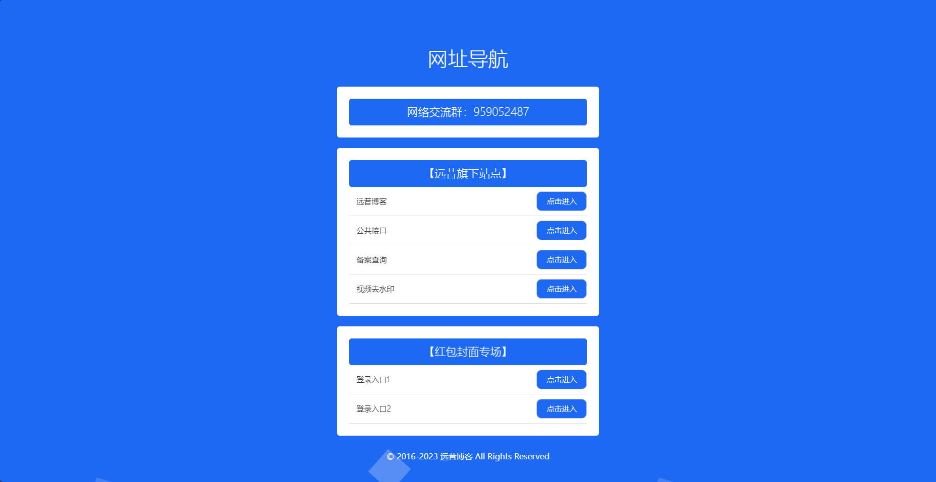
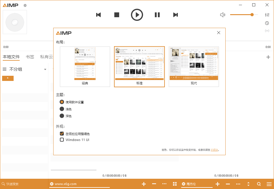
![图片[1]-app下载页源码 二次元样式-胖大海博客资源网](https://pdha.top/wp-content/uploads/pdha.top/2025/06/1748938141792.png)
源码
<!DOCTYPE html><html lang="zh-CN"><head><meta charset="UTF-8"><meta name="viewport" content="width=device-width, initial-scale=1.0"><title>速讯网 - 网站爱好者聚集地</title><link rel="stylesheet" href="https://cdnjs.cloudflare.com/ajax/libs/font-awesome/6.4.0/css/all.min.css"><style>* {margin: 0;padding: 0;box-sizing: border-box;font-family: 'Segoe UI', 'Microsoft YaHei', sans-serif;}body {background: linear-gradient(135deg, #ffcce6 0%, #cce6ff 100%);min-height: 100vh;display: flex;justify-content: center;align-items: center;position: relative;overflow-x: hidden;padding: 20px;}/* 二次元装饰元素 */.anime-element {position: absolute;z-index: 0;}.circle-1 {width: 200px;height: 200px;border-radius: 50%;background: rgba(255, 182, 193, 0.3);top: 10%;left: 5%;}.circle-2 {width: 150px;height: 150px;border-radius: 50%;background: rgba(173, 216, 230, 0.3);bottom: 15%;right: 8%;}.triangle {width: 0;height: 0;border-left: 80px solid transparent;border-right: 80px solid transparent;border-bottom: 140px solid rgba(255, 218, 185, 0.3);transform: rotate(45deg);top: 20%;right: 15%;}.container {position: relative;z-index: 10;max-width: 1200px;width: 100%;display: flex;flex-wrap: wrap;justify-content: center;gap: 40px;background: rgba(255, 255, 255, 0.85);border-radius: 25px;box-shadow: 0 15px 35px rgba(0, 0, 0, 0.1);overflow: hidden;backdrop-filter: blur(10px);padding: 40px;}.left-section {flex: 1;min-width: 300px;display: flex;flex-direction: column;justify-content: center;padding: 20px;}.right-section {flex: 1;min-width: 300px;display: flex;justify-content: center;align-items: center;}.character {width: 100%;max-width: 400px;height: auto;filter: drop-shadow(0 10px 15px rgba(0, 0, 0, 0.1));}.logo {display: flex;align-items: center;margin-bottom: 20px;}.logo-icon {font-size: 2.5rem;color: #ff6b9c;margin-right: 15px;}.logo-text {font-size: 2.2rem;font-weight: 800;background: linear-gradient(45deg, #ff6b9c, #4dabf7);-webkit-background-clip: text;-webkit-text-fill-color: transparent;text-shadow: 0 2px 4px rgba(0, 0, 0, 0.1);}.title {font-size: 3rem;font-weight: 800;margin-bottom: 20px;color: #333;line-height: 1.2;}.title span {color: #ff6b9c;position: relative;}.title span::after {content: '';position: absolute;bottom: 5px;left: 0;width: 100%;height: 10px;background: rgba(255, 107, 156, 0.2);z-index: -1;}.description {font-size: 1.2rem;line-height: 1.8;color: #555;margin-bottom: 30px;max-width: 500px;}.features {display: flex;flex-wrap: wrap;gap: 15px;margin-bottom: 40px;}.feature {background: rgba(255, 255, 255, 0.7);border-radius: 15px;padding: 12px 20px;font-weight: 600;color: #ff6b9c;box-shadow: 0 5px 15px rgba(0, 0, 0, 0.05);display: flex;align-items: center;gap: 8px;}.feature i {font-size: 1.2rem;}.buttons {display: flex;flex-wrap: wrap;gap: 20px;}.btn {display: flex;align-items: center;justify-content: center;gap: 10px;padding: 16px 30px;border-radius: 15px;font-size: 1.1rem;font-weight: 700;cursor: pointer;transition: all 0.3s ease;border: none;box-shadow: 0 5px 15px rgba(0, 0, 0, 0.1);text-decoration: none;}.btn:hover {transform: translateY(-5px);box-shadow: 0 8px 20px rgba(0, 0, 0, 0.15);}.btn-primary {background: linear-gradient(45deg, #ff6b9c, #ff8e8e);color: white;}.btn-secondary {background: linear-gradient(45deg, #4dabf7, #69db7c);color: white;}.btn-tertiary {background: linear-gradient(45deg, #ffa94d, #ffd43b);color: white;}.btn i {font-size: 1.4rem;}.stats {display: flex;gap: 30px;margin-top: 30px;flex-wrap: wrap;}.stat-item {text-align: center;}.stat-number {font-size: 2.2rem;font-weight: 800;color: #ff6b9c;margin-bottom: 5px;}.stat-label {font-size: 1rem;color: #777;font-weight: 500;}.download-text {font-size: 1.1rem;color: #666;margin: 30px 0 15px;font-weight: 600;display: flex;align-items: center;gap: 10px;}.download-text::before,.download-text::after {content: '';flex: 1;height: 2px;background: linear-gradient(to right, transparent, #ff6b9c, transparent);}@media (max-width: 900px) {.container {flex-direction: column;padding: 30px 20px;}.left-section, .right-section {width: 100%;}.title {font-size: 2.5rem;}.character {max-width: 300px;}}@media (max-width: 480px) {.title {font-size: 2rem;}.description {font-size: 1rem;}.btn {padding: 14px 20px;font-size: 1rem;}}/* 动画效果 */@keyframes float {0% { transform: translateY(0px); }50% { transform: translateY(-15px); }100% { transform: translateY(0px); }}.character {animation: float 6s ease-in-out infinite;}.feature {transition: all 0.3s ease;}.feature:hover {transform: scale(1.05);background: white;}.btn:hover i {transform: scale(1.2);}.btn i {transition: transform 0.3s ease;}</style></head><body><!-- 装饰元素 --><div class="anime-element circle-1"></div><div class="anime-element circle-2"></div><div class="anime-element triangle"></div><div class="container"><div class="left-section"><div class="logo"><i class="fas fa-cat logo-icon"></i><div class="logo-text">速讯网</div></div><h1 class="title">探索<span>速讯网</span>的无限可能</h1><p class="description">欢迎来到速讯网!我们提供最新最热的网站源码、社区互动和独家周边。无论你是资深网站爱好者还是刚入坑的新人,这里都有属于你的小天地!</p><div class="features"><div class="feature"><i class="fas fa-star"></i><span>每日更新最新源码</span></div><div class="feature"><i class="fas fa-users"></i><span>百万网站爱好者社区</span></div><div class="feature"><i class="fas fa-gift"></i><span>独家社区你的专属</span></div></div><a href="https://pdha.top" class="btn btn-tertiary"><i class="fas fa-shopping-cart"></i>购买邀请码</a><div class="download-text">立即下载APP体验</div><div class="buttons"><a href="https://pdha.top" class="btn btn-primary"><i class="fab fa-apple"></i>苹果下载</a><a href="https://pdha.top" class="btn btn-secondary"><i class="fab fa-android"></i>安卓下载</a></div><div class="stats"><div class="stat-item"><div class="stat-number">500+</div><div class="stat-label">用户下载</div></div><div class="stat-item"><div class="stat-number">4.0</div><div class="stat-label">应用评分</div></div><div class="stat-item"><div class="stat-number">99%</div><div class="stat-label">用户推荐</div></div></div></div><div class="right-section"><img src="https://pdha.top/wp-content/uploads/2023/04/2023041703093562-scaled.webp" alt="二次元角色" class="character"></div></div><script>// 添加简单的交互效果document.addEventListener('DOMContentLoaded', function() {const buttons = document.querySelectorAll('.btn');buttons.forEach(button => {button.addEventListener('click', function() {// 添加点击效果this.style.transform = 'scale(0.95)';setTimeout(() => {this.style.transform = '';}, 200);// 为购买按钮添加特殊行为if (this.classList.contains('btn-tertiary')) {alert('即将跳转到周边商城页面...');// 实际项目中这里应该是页面跳转}});});// 添加装饰元素动画const elements = document.querySelectorAll('.anime-element');elements.forEach((el, index) => {el.style.animation = `float ${6 + index}s ease-in-out infinite`;});});</script></body></html><!DOCTYPE html> <html lang="zh-CN"> <head> <meta charset="UTF-8"> <meta name="viewport" content="width=device-width, initial-scale=1.0"> <title>速讯网 - 网站爱好者聚集地</title> <link rel="stylesheet" href="https://cdnjs.cloudflare.com/ajax/libs/font-awesome/6.4.0/css/all.min.css"> <style> * { margin: 0; padding: 0; box-sizing: border-box; font-family: 'Segoe UI', 'Microsoft YaHei', sans-serif; } body { background: linear-gradient(135deg, #ffcce6 0%, #cce6ff 100%); min-height: 100vh; display: flex; justify-content: center; align-items: center; position: relative; overflow-x: hidden; padding: 20px; } /* 二次元装饰元素 */ .anime-element { position: absolute; z-index: 0; } .circle-1 { width: 200px; height: 200px; border-radius: 50%; background: rgba(255, 182, 193, 0.3); top: 10%; left: 5%; } .circle-2 { width: 150px; height: 150px; border-radius: 50%; background: rgba(173, 216, 230, 0.3); bottom: 15%; right: 8%; } .triangle { width: 0; height: 0; border-left: 80px solid transparent; border-right: 80px solid transparent; border-bottom: 140px solid rgba(255, 218, 185, 0.3); transform: rotate(45deg); top: 20%; right: 15%; } .container { position: relative; z-index: 10; max-width: 1200px; width: 100%; display: flex; flex-wrap: wrap; justify-content: center; gap: 40px; background: rgba(255, 255, 255, 0.85); border-radius: 25px; box-shadow: 0 15px 35px rgba(0, 0, 0, 0.1); overflow: hidden; backdrop-filter: blur(10px); padding: 40px; } .left-section { flex: 1; min-width: 300px; display: flex; flex-direction: column; justify-content: center; padding: 20px; } .right-section { flex: 1; min-width: 300px; display: flex; justify-content: center; align-items: center; } .character { width: 100%; max-width: 400px; height: auto; filter: drop-shadow(0 10px 15px rgba(0, 0, 0, 0.1)); } .logo { display: flex; align-items: center; margin-bottom: 20px; } .logo-icon { font-size: 2.5rem; color: #ff6b9c; margin-right: 15px; } .logo-text { font-size: 2.2rem; font-weight: 800; background: linear-gradient(45deg, #ff6b9c, #4dabf7); -webkit-background-clip: text; -webkit-text-fill-color: transparent; text-shadow: 0 2px 4px rgba(0, 0, 0, 0.1); } .title { font-size: 3rem; font-weight: 800; margin-bottom: 20px; color: #333; line-height: 1.2; } .title span { color: #ff6b9c; position: relative; } .title span::after { content: ''; position: absolute; bottom: 5px; left: 0; width: 100%; height: 10px; background: rgba(255, 107, 156, 0.2); z-index: -1; } .description { font-size: 1.2rem; line-height: 1.8; color: #555; margin-bottom: 30px; max-width: 500px; } .features { display: flex; flex-wrap: wrap; gap: 15px; margin-bottom: 40px; } .feature { background: rgba(255, 255, 255, 0.7); border-radius: 15px; padding: 12px 20px; font-weight: 600; color: #ff6b9c; box-shadow: 0 5px 15px rgba(0, 0, 0, 0.05); display: flex; align-items: center; gap: 8px; } .feature i { font-size: 1.2rem; } .buttons { display: flex; flex-wrap: wrap; gap: 20px; } .btn { display: flex; align-items: center; justify-content: center; gap: 10px; padding: 16px 30px; border-radius: 15px; font-size: 1.1rem; font-weight: 700; cursor: pointer; transition: all 0.3s ease; border: none; box-shadow: 0 5px 15px rgba(0, 0, 0, 0.1); text-decoration: none; } .btn:hover { transform: translateY(-5px); box-shadow: 0 8px 20px rgba(0, 0, 0, 0.15); } .btn-primary { background: linear-gradient(45deg, #ff6b9c, #ff8e8e); color: white; } .btn-secondary { background: linear-gradient(45deg, #4dabf7, #69db7c); color: white; } .btn-tertiary { background: linear-gradient(45deg, #ffa94d, #ffd43b); color: white; } .btn i { font-size: 1.4rem; } .stats { display: flex; gap: 30px; margin-top: 30px; flex-wrap: wrap; } .stat-item { text-align: center; } .stat-number { font-size: 2.2rem; font-weight: 800; color: #ff6b9c; margin-bottom: 5px; } .stat-label { font-size: 1rem; color: #777; font-weight: 500; } .download-text { font-size: 1.1rem; color: #666; margin: 30px 0 15px; font-weight: 600; display: flex; align-items: center; gap: 10px; } .download-text::before, .download-text::after { content: ''; flex: 1; height: 2px; background: linear-gradient(to right, transparent, #ff6b9c, transparent); } @media (max-width: 900px) { .container { flex-direction: column; padding: 30px 20px; } .left-section, .right-section { width: 100%; } .title { font-size: 2.5rem; } .character { max-width: 300px; } } @media (max-width: 480px) { .title { font-size: 2rem; } .description { font-size: 1rem; } .btn { padding: 14px 20px; font-size: 1rem; } } /* 动画效果 */ @keyframes float { 0% { transform: translateY(0px); } 50% { transform: translateY(-15px); } 100% { transform: translateY(0px); } } .character { animation: float 6s ease-in-out infinite; } .feature { transition: all 0.3s ease; } .feature:hover { transform: scale(1.05); background: white; } .btn:hover i { transform: scale(1.2); } .btn i { transition: transform 0.3s ease; } </style> </head> <body> <!-- 装饰元素 --> <div class="anime-element circle-1"></div> <div class="anime-element circle-2"></div> <div class="anime-element triangle"></div> <div class="container"> <div class="left-section"> <div class="logo"> <i class="fas fa-cat logo-icon"></i> <div class="logo-text">速讯网</div> </div> <h1 class="title">探索<span>速讯网</span>的无限可能</h1> <p class="description"> 欢迎来到速讯网!我们提供最新最热的网站源码、社区互动和独家周边。无论你是资深网站爱好者还是刚入坑的新人,这里都有属于你的小天地! </p> <div class="features"> <div class="feature"> <i class="fas fa-star"></i> <span>每日更新最新源码</span> </div> <div class="feature"> <i class="fas fa-users"></i> <span>百万网站爱好者社区</span> </div> <div class="feature"> <i class="fas fa-gift"></i> <span>独家社区你的专属</span> </div> </div> <a href="https://pdha.top" class="btn btn-tertiary"> <i class="fas fa-shopping-cart"></i> 购买邀请码 </a> <div class="download-text">立即下载APP体验</div> <div class="buttons"> <a href="https://pdha.top" class="btn btn-primary"> <i class="fab fa-apple"></i> 苹果下载 </a> <a href="https://pdha.top" class="btn btn-secondary"> <i class="fab fa-android"></i> 安卓下载 </a> </div> <div class="stats"> <div class="stat-item"> <div class="stat-number">500+</div> <div class="stat-label">用户下载</div> </div> <div class="stat-item"> <div class="stat-number">4.0</div> <div class="stat-label">应用评分</div> </div> <div class="stat-item"> <div class="stat-number">99%</div> <div class="stat-label">用户推荐</div> </div> </div> </div> <div class="right-section"> <img src="https://pdha.top/wp-content/uploads/2023/04/2023041703093562-scaled.webp" alt="二次元角色" class="character"> </div> </div> <script> // 添加简单的交互效果 document.addEventListener('DOMContentLoaded', function() { const buttons = document.querySelectorAll('.btn'); buttons.forEach(button => { button.addEventListener('click', function() { // 添加点击效果 this.style.transform = 'scale(0.95)'; setTimeout(() => { this.style.transform = ''; }, 200); // 为购买按钮添加特殊行为 if (this.classList.contains('btn-tertiary')) { alert('即将跳转到周边商城页面...'); // 实际项目中这里应该是页面跳转 } }); }); // 添加装饰元素动画 const elements = document.querySelectorAll('.anime-element'); elements.forEach((el, index) => { el.style.animation = `float ${6 + index}s ease-in-out infinite`; }); }); </script> </body> </html><!DOCTYPE html> <html lang="zh-CN"> <head> <meta charset="UTF-8"> <meta name="viewport" content="width=device-width, initial-scale=1.0"> <title>速讯网 - 网站爱好者聚集地</title> <link rel="stylesheet" href="https://cdnjs.cloudflare.com/ajax/libs/font-awesome/6.4.0/css/all.min.css"> <style> * { margin: 0; padding: 0; box-sizing: border-box; font-family: 'Segoe UI', 'Microsoft YaHei', sans-serif; } body { background: linear-gradient(135deg, #ffcce6 0%, #cce6ff 100%); min-height: 100vh; display: flex; justify-content: center; align-items: center; position: relative; overflow-x: hidden; padding: 20px; } /* 二次元装饰元素 */ .anime-element { position: absolute; z-index: 0; } .circle-1 { width: 200px; height: 200px; border-radius: 50%; background: rgba(255, 182, 193, 0.3); top: 10%; left: 5%; } .circle-2 { width: 150px; height: 150px; border-radius: 50%; background: rgba(173, 216, 230, 0.3); bottom: 15%; right: 8%; } .triangle { width: 0; height: 0; border-left: 80px solid transparent; border-right: 80px solid transparent; border-bottom: 140px solid rgba(255, 218, 185, 0.3); transform: rotate(45deg); top: 20%; right: 15%; } .container { position: relative; z-index: 10; max-width: 1200px; width: 100%; display: flex; flex-wrap: wrap; justify-content: center; gap: 40px; background: rgba(255, 255, 255, 0.85); border-radius: 25px; box-shadow: 0 15px 35px rgba(0, 0, 0, 0.1); overflow: hidden; backdrop-filter: blur(10px); padding: 40px; } .left-section { flex: 1; min-width: 300px; display: flex; flex-direction: column; justify-content: center; padding: 20px; } .right-section { flex: 1; min-width: 300px; display: flex; justify-content: center; align-items: center; } .character { width: 100%; max-width: 400px; height: auto; filter: drop-shadow(0 10px 15px rgba(0, 0, 0, 0.1)); } .logo { display: flex; align-items: center; margin-bottom: 20px; } .logo-icon { font-size: 2.5rem; color: #ff6b9c; margin-right: 15px; } .logo-text { font-size: 2.2rem; font-weight: 800; background: linear-gradient(45deg, #ff6b9c, #4dabf7); -webkit-background-clip: text; -webkit-text-fill-color: transparent; text-shadow: 0 2px 4px rgba(0, 0, 0, 0.1); } .title { font-size: 3rem; font-weight: 800; margin-bottom: 20px; color: #333; line-height: 1.2; } .title span { color: #ff6b9c; position: relative; } .title span::after { content: ''; position: absolute; bottom: 5px; left: 0; width: 100%; height: 10px; background: rgba(255, 107, 156, 0.2); z-index: -1; } .description { font-size: 1.2rem; line-height: 1.8; color: #555; margin-bottom: 30px; max-width: 500px; } .features { display: flex; flex-wrap: wrap; gap: 15px; margin-bottom: 40px; } .feature { background: rgba(255, 255, 255, 0.7); border-radius: 15px; padding: 12px 20px; font-weight: 600; color: #ff6b9c; box-shadow: 0 5px 15px rgba(0, 0, 0, 0.05); display: flex; align-items: center; gap: 8px; } .feature i { font-size: 1.2rem; } .buttons { display: flex; flex-wrap: wrap; gap: 20px; } .btn { display: flex; align-items: center; justify-content: center; gap: 10px; padding: 16px 30px; border-radius: 15px; font-size: 1.1rem; font-weight: 700; cursor: pointer; transition: all 0.3s ease; border: none; box-shadow: 0 5px 15px rgba(0, 0, 0, 0.1); text-decoration: none; } .btn:hover { transform: translateY(-5px); box-shadow: 0 8px 20px rgba(0, 0, 0, 0.15); } .btn-primary { background: linear-gradient(45deg, #ff6b9c, #ff8e8e); color: white; } .btn-secondary { background: linear-gradient(45deg, #4dabf7, #69db7c); color: white; } .btn-tertiary { background: linear-gradient(45deg, #ffa94d, #ffd43b); color: white; } .btn i { font-size: 1.4rem; } .stats { display: flex; gap: 30px; margin-top: 30px; flex-wrap: wrap; } .stat-item { text-align: center; } .stat-number { font-size: 2.2rem; font-weight: 800; color: #ff6b9c; margin-bottom: 5px; } .stat-label { font-size: 1rem; color: #777; font-weight: 500; } .download-text { font-size: 1.1rem; color: #666; margin: 30px 0 15px; font-weight: 600; display: flex; align-items: center; gap: 10px; } .download-text::before, .download-text::after { content: ''; flex: 1; height: 2px; background: linear-gradient(to right, transparent, #ff6b9c, transparent); } @media (max-width: 900px) { .container { flex-direction: column; padding: 30px 20px; } .left-section, .right-section { width: 100%; } .title { font-size: 2.5rem; } .character { max-width: 300px; } } @media (max-width: 480px) { .title { font-size: 2rem; } .description { font-size: 1rem; } .btn { padding: 14px 20px; font-size: 1rem; } } /* 动画效果 */ @keyframes float { 0% { transform: translateY(0px); } 50% { transform: translateY(-15px); } 100% { transform: translateY(0px); } } .character { animation: float 6s ease-in-out infinite; } .feature { transition: all 0.3s ease; } .feature:hover { transform: scale(1.05); background: white; } .btn:hover i { transform: scale(1.2); } .btn i { transition: transform 0.3s ease; } </style> </head> <body> <!-- 装饰元素 --> <div class="anime-element circle-1"></div> <div class="anime-element circle-2"></div> <div class="anime-element triangle"></div> <div class="container"> <div class="left-section"> <div class="logo"> <i class="fas fa-cat logo-icon"></i> <div class="logo-text">速讯网</div> </div> <h1 class="title">探索<span>速讯网</span>的无限可能</h1> <p class="description"> 欢迎来到速讯网!我们提供最新最热的网站源码、社区互动和独家周边。无论你是资深网站爱好者还是刚入坑的新人,这里都有属于你的小天地! </p> <div class="features"> <div class="feature"> <i class="fas fa-star"></i> <span>每日更新最新源码</span> </div> <div class="feature"> <i class="fas fa-users"></i> <span>百万网站爱好者社区</span> </div> <div class="feature"> <i class="fas fa-gift"></i> <span>独家社区你的专属</span> </div> </div> <a href="https://pdha.top" class="btn btn-tertiary"> <i class="fas fa-shopping-cart"></i> 购买邀请码 </a> <div class="download-text">立即下载APP体验</div> <div class="buttons"> <a href="https://pdha.top" class="btn btn-primary"> <i class="fab fa-apple"></i> 苹果下载 </a> <a href="https://pdha.top" class="btn btn-secondary"> <i class="fab fa-android"></i> 安卓下载 </a> </div> <div class="stats"> <div class="stat-item"> <div class="stat-number">500+</div> <div class="stat-label">用户下载</div> </div> <div class="stat-item"> <div class="stat-number">4.0</div> <div class="stat-label">应用评分</div> </div> <div class="stat-item"> <div class="stat-number">99%</div> <div class="stat-label">用户推荐</div> </div> </div> </div> <div class="right-section"> <img src="https://pdha.top/wp-content/uploads/2023/04/2023041703093562-scaled.webp" alt="二次元角色" class="character"> </div> </div> <script> // 添加简单的交互效果 document.addEventListener('DOMContentLoaded', function() { const buttons = document.querySelectorAll('.btn'); buttons.forEach(button => { button.addEventListener('click', function() { // 添加点击效果 this.style.transform = 'scale(0.95)'; setTimeout(() => { this.style.transform = ''; }, 200); // 为购买按钮添加特殊行为 if (this.classList.contains('btn-tertiary')) { alert('即将跳转到周边商城页面...'); // 实际项目中这里应该是页面跳转 } }); }); // 添加装饰元素动画 const elements = document.querySelectorAll('.anime-element'); elements.forEach((el, index) => { el.style.animation = `float ${6 + index}s ease-in-out infinite`; }); }); </script> </body> </html>
感谢您的来访,获取更多精彩文章请收藏本站。

© 版权声明
THE END


暂无评论内容