


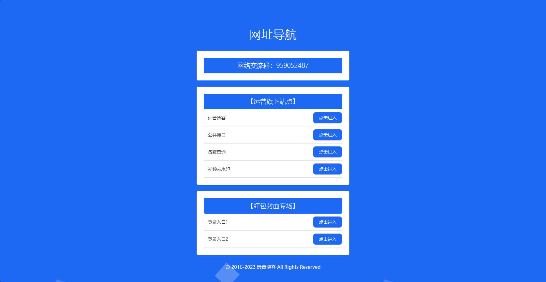
![图片[1]-高考倒计时HTML源码-胖大海博客资源网](https://pdha.top/wp-content/uploads/pdha.top/2025/06/1748937391783.png)
<!DOCTYPE html><html lang="zh-CN"><head><meta charset="UTF-8"><meta name="viewport" content="width=device-width, initial-scale=1.0"><title>高考冲刺倒计时 | 金榜题名</title><link rel="stylesheet" href="https://cdnjs.cloudflare.com/ajax/libs/font-awesome/6.4.0/css/all.min.css"><style>:root {--primary-color: #ff4757;--secondary-color: #2ed573;--gold-color: #ffd700;--tech-blue: #2d8cf0;--tech-purple: #7265e6;--success-color: #7bed9f;}* {margin: 0;padding: 0;box-sizing: border-box;}body {font-family: "PingFang SC", "Microsoft Yahei", sans-serif;background: linear-gradient(135deg, #000428 0%, #004e92 100%);display: flex;flex-direction: column;justify-content: center;align-items: center;min-height: 100vh;margin: 0;position: relative;overflow-x: hidden;color: #fff;}/* 修复粒子背景层级问题 */.particles {position: fixed;top: 0;left: 0;width: 100%;height: 100%;z-index: 0;}/* 科技感光效背景 */.tech-bg {position: absolute;width: 100%;height: 100%;background:radial-gradient(circle at 20% 30%, rgba(45, 140, 240, 0.15) 0%, transparent 40%),radial-gradient(circle at 80% 70%, rgba(114, 101, 230, 0.15) 0%, transparent 40%),radial-gradient(circle at 50% 20%, rgba(255, 215, 0, 0.1) 0%, transparent 40%);z-index: 1;animation: pulse 8s infinite alternate;}@keyframes pulse {0% { opacity: 0.5; }100% { opacity: 1; }}/* 全息投影效果 */.holographic {position: absolute;width: 100%;height: 100%;background:linear-gradient(90deg, rgba(114, 101, 230, 0.05) 1px, transparent 1px),linear-gradient(rgba(114, 101, 230, 0.05) 1px, transparent 1px);background-size: 20px 20px;z-index: 1;opacity: 0.3;}.container {position: relative;text-align: center;background: rgba(10, 15, 35, 0.85);padding: 1.5rem;border-radius: 1.2rem;box-shadow: 0 0 40px rgba(45, 140, 240, 0.3),0 0 20px rgba(114, 101, 230, 0.3);width: 95%;max-width: 800px;z-index: 2;backdrop-filter: blur(8px);border: 1px solid rgba(114, 101, 230, 0.5);animation: glow 3s infinite alternate;border-top: 3px solid var(--gold-color);overflow: hidden;margin: 1rem 0;}.container::before {content: "";position: absolute;top: 0;left: -100%;width: 200%;height: 3px;background: linear-gradient(90deg, transparent, var(--tech-blue), transparent);animation: scanline 4s linear infinite;}@keyframes scanline {0% { left: -100%; }100% { left: 100%; }}@keyframes glow {from {box-shadow: 0 0 20px rgba(45, 140, 240, 0.3),0 0 30px rgba(114, 101, 230, 0.3);}to {box-shadow: 0 0 40px rgba(45, 140, 240, 0.6),0 0 50px rgba(114, 101, 230, 0.6);}}.title {color: var(--gold-color);font-size: 2.2rem;margin: 0.5rem 0;text-shadow: 0 0 15px rgba(255, 215, 0, 0.7);position: relative;display: inline-block;background: linear-gradient(90deg, #ffd700, #ff6b6b, #48dbfb);-webkit-background-clip: text;background-clip: text;color: transparent;animation: title-gradient 8s infinite alternate;}@keyframes title-gradient {0% { background-position: 0% 50%; }100% { background-position: 100% 50%; }}.title::after {content: "";position: absolute;bottom: -8px;left: 50%;transform: translateX(-50%);width: 70%;height: 2px;background: linear-gradient(90deg, transparent, var(--gold-color), transparent);border-radius: 50%;filter: blur(2px);}.subtitle {color: var(--success-color);font-size: 1rem;margin: 0.5rem 0 1rem;text-shadow: 0 0 5px rgba(123, 237, 159, 0.5);font-weight: 300;}#countdown {font-size: 1.4rem;display: grid;grid-template-columns: repeat(2, 1fr);gap: 0.8rem;margin: 1.2rem 0;}.time-unit {padding: 1rem 0.5rem;border-radius: 0.8rem;background: rgba(20, 30, 60, 0.7);box-shadow: 0 0 10px rgba(45, 140, 240, 0.3);transition: all 0.3s ease;position: relative;overflow: hidden;border: 1px solid rgba(45, 140, 240, 0.3);perspective: 500px;transform-style: preserve-3d;}.time-unit::before {content: "";position: absolute;top: 0;left: 0;width: 100%;height: 2px;background: linear-gradient(90deg, transparent, var(--tech-blue), transparent);}.time-unit .number {display: block;font-size: 2rem;font-weight: bold;color: #fff;text-shadow: 0 0 8px var(--tech-blue);transition: transform 0.5s ease;font-family: 'Arial', sans-serif;}.time-unit .number.changing {animation: flip 0.5s ease;}@keyframes flip {0% { transform: rotateX(0deg); }50% { transform: rotateX(90deg); }100% { transform: rotateX(0deg); }}.time-unit span {display: block;font-size: 0.9rem;color: var(--secondary-color);margin-top: 0.3rem;text-transform: uppercase;letter-spacing: 1px;font-weight: 300;}/* 励志语句轮播 */.quote-carousel {min-height: 80px;margin: 1rem 0;position: relative;overflow: hidden;border-radius: 8px;background: rgba(20, 30, 60, 0.3);padding: 10px;border: 1px solid rgba(114, 101, 230, 0.2);}.quote {position: absolute;width: 100%;top: 50%;left: 0;transform: translateY(-50%);opacity: 0;transition: opacity 1s ease, transform 1s ease;font-style: italic;color: #e6f7ff;font-size: 1rem;padding: 0 15px;text-shadow: 0 0 4px rgba(255, 255, 255, 0.3);}.quote.active {opacity: 1;transform: translateY(-50%) scale(1.05);}/* 成功之路进度条 */.progress-container {margin: 1.2rem 0;position: relative;}.progress-label {display: flex;justify-content: space-between;margin-bottom: 8px;font-size: 0.8rem;color: #a3d5ff;}.progress-bar {height: 12px;background: rgba(40, 50, 80, 0.7);border-radius: 8px;overflow: hidden;position: relative;box-shadow: inset 0 0 6px rgba(0, 0, 0, 0.5);}.progress {height: 100%;background: linear-gradient(90deg, var(--primary-color), var(--secondary-color));width: 0;transition: width 0.8s cubic-bezier(0.22, 0.61, 0.36, 1);position: relative;overflow: hidden;}.progress::after {content: "";position: absolute;top: 0;left: 0;width: 100%;height: 100%;background: linear-gradient(90deg, transparent, rgba(255, 255, 255, 0.3), transparent);animation: shine 2s infinite;}@keyframes shine {0% { transform: translateX(-100%); }100% { transform: translateX(100%); }}/* 科技感装饰图标 */.deco-icons {display: flex;justify-content: center;gap: 15px;margin: 1rem 0;}.deco-icon {width: 50px;height: 50px;border-radius: 50%;background: rgba(20, 30, 60, 0.7);display: flex;justify-content: center;align-items: center;font-size: 20px;color: var(--gold-color);box-shadow: 0 0 10px rgba(45, 140, 240, 0.3);position: relative;overflow: hidden;border: 1px solid rgba(45, 140, 240, 0.3);animation: float 4s ease-in-out infinite;}.deco-icon:nth-child(1) { animation-delay: 0s; }.deco-icon:nth-child(2) { animation-delay: 0.5s; }.deco-icon:nth-child(3) { animation-delay: 1s; }.deco-icon::before {content: "";position: absolute;width: 100%;height: 100%;background: radial-gradient(circle at center, rgba(45, 140, 240, 0.3), transparent 70%);animation: rotate 8s linear infinite;}@keyframes rotate {from { transform: rotate(0deg); }to { transform: rotate(360deg); }}@keyframes float {0% { transform: translateY(0px); }50% { transform: translateY(-8px); }100% { transform: translateY(0px); }}/* 音频控制面板 */.music-panel {background: rgba(20, 30, 60, 0.7);border-radius: 40px;padding: 8px 15px;margin: 15px auto;width: 95%;max-width: 500px;display: flex;align-items: center;justify-content: center;gap: 10px;border: 1px solid rgba(114, 101, 230, 0.3);box-shadow: 0 0 10px rgba(45, 140, 240, 0.3);flex-wrap: wrap;}.music-control {background: rgba(30, 40, 70, 0.8);width: 40px;height: 40px;border-radius: 50%;display: flex;justify-content: center;align-items: center;cursor: pointer;border: 1px solid rgba(114, 101, 230, 0.3);transition: all 0.3s ease;}.music-control:hover {transform: scale(1.1);box-shadow: 0 0 8px rgba(45, 140, 240, 0.5);}.music-control i {font-size: 18px;color: var(--gold-color);}.music-info {flex-grow: 1;text-align: center;font-size: 0.9rem;color: #a3d5ff;white-space: nowrap;overflow: hidden;text-overflow: ellipsis;padding: 0 8px;}.volume-control {display: flex;align-items: center;gap: 5px;width: 100px;}.volume-control i {color: var(--gold-color);font-size: 16px;}.volume-slider {width: 100%;-webkit-appearance: none;height: 4px;border-radius: 4px;background: rgba(100, 100, 100, 0.5);outline: none;}.volume-slider::-webkit-slider-thumb {-webkit-appearance: none;width: 12px;height: 12px;border-radius: 50%;background: var(--gold-color);cursor: pointer;}/* 成功祝福区 */.success-section {margin: 15px 0 10px;padding: 15px;border-radius: 12px;background: rgba(123, 237, 159, 0.1);border: 1px solid rgba(123, 237, 159, 0.2);position: relative;overflow: hidden;}.success-section::before {content: "";position: absolute;top: 0;left: 0;width: 100%;height: 2px;background: linear-gradient(90deg, transparent, var(--success-color), transparent);animation: scanline 3s linear infinite;}.success-title {color: var(--success-color);font-size: 1.2rem;margin-bottom: 8px;text-shadow: 0 0 4px rgba(123, 237, 159, 0.5);}.success-message {font-size: 0.95rem;color: #e6f7ff;line-height: 1.5;}/* 播放列表样式 */.playlist-container {width: 100%;max-height: 120px;overflow-y: auto;background: rgba(20, 30, 60, 0.5);border-radius: 8px;margin: 8px 0;padding: 8px;border: 1px solid rgba(114, 101, 230, 0.2);}.playlist-title {color: var(--success-color);font-size: 0.95rem;margin-bottom: 6px;text-align: left;}.playlist-item {padding: 6px 8px;border-radius: 4px;background: rgba(30, 40, 70, 0.4);margin: 4px 0;text-align: left;cursor: pointer;transition: all 0.3s ease;font-size: 0.85rem;color: #a3d5ff;white-space: nowrap;overflow: hidden;text-overflow: ellipsis;}.playlist-item:hover {background: rgba(45, 140, 240, 0.5);}.playlist-item.active {background: rgba(123, 237, 159, 0.3);color: #fff;}/* 进度条样式 */.music-progress {width: 100%;height: 3px;background: rgba(100, 100, 100, 0.3);border-radius: 2px;margin-top: 8px;position: relative;cursor: pointer;}.music-progress-bar {height: 100%;width: 0%;background: var(--tech-blue);border-radius: 2px;position: relative;}.music-progress-bar::after {content: "";position: absolute;right: 0;top: 50%;transform: translateY(-50%);width: 8px;height: 8px;background: var(--gold-color);border-radius: 50%;}.time-info {display: flex;justify-content: space-between;font-size: 0.75rem;color: #a3d5ff;margin-top: 4px;}/* 新增:日期显示 */.date-display {font-size: 1rem;margin: 8px 0 15px;color: #a3d5ff;text-shadow: 0 0 4px rgba(45, 140, 240, 0.5);}/* 新增:激励按钮 */.motivation-btn {background: linear-gradient(135deg, var(--tech-blue), var(--tech-purple));border: none;border-radius: 40px;color: white;padding: 10px 25px;font-size: 1rem;cursor: pointer;margin: 12px 0;transition: all 0.3s ease;box-shadow: 0 4px 12px rgba(0, 0, 0, 0.3);position: relative;overflow: hidden;}.motivation-btn:hover {transform: translateY(-2px);box-shadow: 0 6px 15px rgba(0, 0, 0, 0.4);}.motivation-btn:active {transform: translateY(1px);}.motivation-btn::after {content: "";position: absolute;top: 0;left: -100%;width: 100%;height: 100%;background: linear-gradient(90deg, transparent, rgba(255, 255, 255, 0.3), transparent);animation: shine 3s infinite;}/* 底部版权信息 */.footer {position: relative;color: rgba(255, 255, 255, 0.6);font-size: 0.75rem;z-index: 3;text-align: center;width: 100%;margin-top: 1rem;padding: 0.5rem;}/* 移动端优化 */@media (min-width: 768px) {.container {padding: 2rem;}.title {font-size: 2.8rem;margin-bottom: 1.2rem;}.subtitle {font-size: 1.1rem;margin-bottom: 1.5rem;}#countdown {font-size: 1.6rem;grid-template-columns: repeat(4, 1fr);gap: 1.2rem;margin: 2rem 0;}.time-unit {padding: 1.2rem 0.5rem;}.time-unit .number {font-size: 2.4rem;}.time-unit span {font-size: 1rem;}.quote-carousel {min-height: 90px;margin: 1.2rem 0;}.quote {font-size: 1.1rem;}.progress-container {margin: 1.5rem 0;}.progress-bar {height: 14px;}.music-panel {padding: 10px 20px;gap: 12px;}.music-control {width: 42px;height: 42px;}.music-info {font-size: 1rem;}.deco-icons {gap: 20px;margin: 1.2rem 0;}.deco-icon {width: 60px;height: 60px;font-size: 24px;}.success-section {padding: 18px;margin: 18px 0 12px;}.success-title {font-size: 1.3rem;}.success-message {font-size: 1.05rem;}.motivation-btn {padding: 12px 30px;font-size: 1.1rem;}.playlist-container {max-height: 140px;}}@media (max-width: 480px) {.title {font-size: 1.8rem;}.time-unit .number {font-size: 1.8rem;}.time-unit span {font-size: 0.8rem;}.quote-carousel {min-height: 70px;padding: 8px;}.music-info {font-size: 0.85rem;}.volume-control {width: 90px;}.success-section {padding: 12px;}}</style></head><body><canvas class="particles" id="particles"></canvas><div class="tech-bg"></div><div class="holographic"></div><div class="container"><h1 class="title">📚 高考冲刺倒计时</h1><div class="subtitle">金榜题名 · 前程似锦 · 未来可期</div><div class="date-display" id="currentDate"></div><div id="countdown"></div><div class="progress-container"><div class="progress-label"><span>奋斗开始</span><span id="progressText">已坚持 0%</span><span>金榜题名</span></div><div class="progress-bar"><div class="progress" id="progress"></div></div></div><button class="motivation-btn" id="motivationBtn"><i class="fas fa-fire"></i> 获取今日激励</button><div class="music-panel"><div class="music-control" id="prevBtn"><i class="fas fa-step-backward"></i></div><div class="music-control" id="playBtn"><i class="fas fa-play"></i></div><div class="music-control" id="nextBtn"><i class="fas fa-step-forward"></i></div><div class="music-info" id="musicInfo">励志音乐播放中...</div><div class="volume-control"><i class="fas fa-volume-up"></i><input type="range" min="0" max="1" step="0.1" value="0.5" class="volume-slider" id="volumeSlider"></div></div><!-- 音乐进度条 --><div class="music-progress" id="musicProgress"><div class="music-progress-bar" id="musicProgressBar"></div></div><div class="time-info"><span id="currentTime">00:00</span><span id="duration">00:00</span></div><!-- 播放列表 --><div class="playlist-container"><div class="playlist-title">励志音乐列表</div><div id="playlist"></div></div><div class="quote-carousel"><div class="quote active">"十年寒窗磨一剑,今朝出鞘试锋芒"</div><div class="quote">"希君生羽翼,一化北溟鱼"</div><div class="quote">"鹏北海,凤朝阳,又携书剑路茫茫"</div><div class="quote">"青春须早为,岂能长少年"</div><div class="quote">"少年辛苦终身事,莫向光阴惰寸功"</div><div class="quote">"追风赶月莫停留,平芜尽处是春山"</div></div><div class="success-section"><h3 class="success-title">🎉 成功祝福</h3><p class="success-message">所有的努力终将绽放,所有的汗水终将结晶。愿你提笔征战四方,愿你合笔谈笑清风。高考是人生的重要驿站,但不是终点。无论结果如何,你都是最棒的!</p></div><div class="deco-icons"><div class="deco-icon"><i class="fas fa-trophy"></i></div><div class="deco-icon"><i class="fas fa-medal"></i></div><div class="deco-icon"><i class="fas fa-graduation-cap"></i></div></div></div><div class="footer">为梦想而战 · 高考倒计时 · 2025</div><!-- 音频元素 --><audio id="bgMusic" loop></audio><script>// 初始化函数function init() {setupParticles();countdown();startQuoteCarousel();setupAudioControl();displayCurrentDate();setupMotivationButton();}// 显示当前日期function displayCurrentDate() {const now = new Date();const options = {year: 'numeric',month: 'long',day: 'numeric',weekday: 'long'};const dateString = now.toLocaleDateString('zh-CN', options);document.getElementById('currentDate').textContent = dateString;}// 倒计时核心逻辑function countdown() {const examDate = new Date("2025-06-07T09:00:00");const now = new Date();const startDate = new Date("2024-09-01T00:00:00");const totalTime = examDate - startDate;const passedTime = now - startDate;// 更新进度条const progressPercent = Math.min(100, Math.max(0, (passedTime / totalTime * 100)));document.getElementById('progress').style.width = `${progressPercent}%`;document.getElementById('progressText').textContent = `已坚持 ${progressPercent.toFixed(1)}%`;const diff = examDate - now;if (diff <= 0) {document.getElementById("countdown").innerHTML = `<div class="result-message"><h2>🎉 金榜题名!</h2><p>所有努力终将开花结果</p></div>`;return;}const units = [{ value: Math.floor(diff / 864e5), label: '天' },{ value: Math.floor((diff % 864e5) / 36e5), label: '时' },{ value: Math.floor((diff % 36e5) / 6e4), label: '分' },{ value: Math.floor((diff % 6e4) / 1e3), label: '秒' }];// 获取当前显示的数字const currentUnits = document.querySelectorAll('.time-unit .number');let hasChanged = false;document.getElementById("countdown").innerHTML = units.map((unit, index) => {const currentValue = currentUnits[index] ? currentUnits[index].textContent : '00';const newValue = unit.value.toString().padStart(2, '0');// 检查值是否变化const isChanging = currentValue !== newValue;if (isChanging) hasChanged = true;return `<div class="time-unit"><span class="number ${isChanging ? 'changing' : ''}">${newValue}</span><span>${unit.label}</span></div>`;}).join('');// 如果值变化,播放滴答声if (hasChanged) {playTickSound();}setTimeout(countdown, 1000);}function playTickSound() {const tick = new Audio("data:audio/wav;base64,UklGRigAAABXQVZFZm10IBAAAAABAAEARKwAAIhYAQACABAAZGF0YQQAAAAA");tick.volume = 0.2;tick.play().catch(e => console.log("滴答音效播放失败:", e));}// 励志语句轮播function startQuoteCarousel() {const quotes = document.querySelectorAll('.quote');let current = 0;setInterval(() => {quotes[current].classList.remove('active');current = (current + 1) % quotes.length;quotes[current].classList.add('active');}, 5000);}// 音频控制function setupAudioControl() {const bgMusic = document.getElementById('bgMusic');const playBtn = document.getElementById('playBtn');const prevBtn = document.getElementById('prevBtn');const nextBtn = document.getElementById('nextBtn');const volumeSlider = document.getElementById('volumeSlider');const musicInfo = document.getElementById('musicInfo');const playlist = document.getElementById('playlist');const musicProgress = document.getElementById('musicProgress');const musicProgressBar = document.getElementById('musicProgressBar');const currentTimeEl = document.getElementById('currentTime');const durationEl = document.getElementById('duration');let currentTrack = 0;let isPlaying = true;// 预定义音乐列表 (从audio文件夹加载)const playlistItems = [{ name: "励志音乐1", url: "music1.mp3" },{ name: "励志音乐2", url: "music2.mp3" },{ name: "励志音乐3", url: "music3.mp3" },{ name: "励志音乐4", url: "music4.mp3" }];// 设置初始音量bgMusic.volume = 0.5;// 初始化播放列表playlistItems.forEach((track, index) => {const item = document.createElement('div');item.className = 'playlist-item';item.textContent = track.name;item.dataset.index = index;item.addEventListener('click', () => {// 移除之前的活动项document.querySelectorAll('.playlist-item').forEach(el => {el.classList.remove('active');});// 设置当前活动项item.classList.add('active');currentTrack = index;playTrack(currentTrack);musicInfo.textContent = "播放中: " + track.name;});playlist.appendChild(item);});// 默认播放第一首if (playlistItems.length > 0) {playlist.children[0].classList.add('active');playTrack(0);musicInfo.textContent = "播放中: " + playlistItems[0].name;}// 播放/暂停按钮playBtn.addEventListener('click', () => {if (bgMusic.src) {if (isPlaying) {bgMusic.pause();playBtn.innerHTML = '<i class="fas fa-play"></i>';musicInfo.textContent = "已暂停";} else {bgMusic.play();playBtn.innerHTML = '<i class="fas fa-pause"></i>';musicInfo.textContent = "播放中: " + playlistItems[currentTrack].name;}isPlaying = !isPlaying;} else {musicInfo.textContent = "请先选择音乐文件";}});// 上一首prevBtn.addEventListener('click', () => {if (playlistItems.length > 0) {currentTrack = (currentTrack - 1 + playlistItems.length) % playlistItems.length;playTrack(currentTrack);// 更新播放列表高亮document.querySelectorAll('.playlist-item').forEach(el => {el.classList.remove('active');});playlist.children[currentTrack].classList.add('active');musicInfo.textContent = "播放中: " + playlistItems[currentTrack].name;} else {musicInfo.textContent = "播放列表为空";}});// 下一首nextBtn.addEventListener('click', () => {if (playlistItems.length > 0) {currentTrack = (currentTrack + 1) % playlistItems.length;playTrack(currentTrack);// 更新播放列表高亮document.querySelectorAll('.playlist-item').forEach(el => {el.classList.remove('active');});playlist.children[currentTrack].classList.add('active');musicInfo.textContent = "播放中: " + playlistItems[currentTrack].name;} else {musicInfo.textContent = "播放列表为空";}});// 音量控制volumeSlider.addEventListener('input', () => {bgMusic.volume = volumeSlider.value;});// 播放指定曲目function playTrack(index) {if (playlistItems.length > index) {bgMusic.src = playlistItems[index].url;bgMusic.play();isPlaying = true;playBtn.innerHTML = '<i class="fas fa-pause"></i>';}}// 更新进度条bgMusic.addEventListener('timeupdate', () => {if (bgMusic.duration) {const percent = (bgMusic.currentTime / bgMusic.duration) * 100;musicProgressBar.style.width = percent + '%';// 更新时间显示currentTimeEl.textContent = formatTime(bgMusic.currentTime);durationEl.textContent = formatTime(bgMusic.duration);}});// 点击进度条跳转musicProgress.addEventListener('click', (e) => {const rect = musicProgress.getBoundingClientRect();const percent = (e.clientX - rect.left) / rect.width;bgMusic.currentTime = percent * bgMusic.duration;});// 音乐结束自动下一首bgMusic.addEventListener('ended', () => {if (playlistItems.length > 0) {currentTrack = (currentTrack + 1) % playlistItems.length;playTrack(currentTrack);// 更新播放列表高亮document.querySelectorAll('.playlist-item').forEach(el => {el.classList.remove('active');});playlist.children[currentTrack].classList.add('active');musicInfo.textContent = "播放中: " + playlistItems[currentTrack].name;}});// 格式化时间function formatTime(seconds) {if (isNaN(seconds)) return "00:00";const min = Math.floor(seconds / 60);const sec = Math.floor(seconds % 60);return `${min.toString().padStart(2, '0')}:${sec.toString().padStart(2, '0')}`;}}// 激励按钮function setupMotivationButton() {const btn = document.getElementById('motivationBtn');const quotes = ["加油!每一天的努力都是未来的基石","今天的汗水,明天的骄傲","坚持就是胜利,相信自己","你比自己想象的更强大","每一次努力都不会白费","梦想就在前方,继续前进","今天的付出,明天的收获","你是最棒的,继续加油!"];btn.addEventListener('click', () => {// 随机选择一个激励语句const randomIndex = Math.floor(Math.random() * quotes.length);const quote = quotes[randomIndex];// 创建临时提示const tempMessage = document.createElement('div');tempMessage.textContent = quote;tempMessage.style.position = 'fixed';tempMessage.style.top = '50%';tempMessage.style.left = '50%';tempMessage.style.transform = 'translate(-50%, -50%)';tempMessage.style.backgroundColor = 'rgba(45, 140, 240, 0.9)';tempMessage.style.color = 'white';tempMessage.style.padding = '15px 30px';tempMessage.style.borderRadius = '50px';tempMessage.style.zIndex = '100';tempMessage.style.fontSize = '1.2rem';tempMessage.style.boxShadow = '0 0 20px rgba(45, 140, 240, 0.7)';tempMessage.style.animation = 'fadeInOut 3s forwards';// 添加动画const style = document.createElement('style');style.textContent = `@keyframes fadeInOut {0% { opacity: 0; transform: translate(-50%, -40%); }20% { opacity: 1; transform: translate(-50%, -50%); }80% { opacity: 1; transform: translate(-50%, -50%); }100% { opacity: 0; transform: translate(-50%, -60%); }}`;document.head.appendChild(style);document.body.appendChild(tempMessage);// 3秒后移除setTimeout(() => {document.body.removeChild(tempMessage);document.head.removeChild(style);}, 3000);});}// 粒子动画function setupParticles() {const canvas = document.getElementById('particles');const ctx = canvas.getContext('2d');function resize() {canvas.width = window.innerWidth;canvas.height = window.innerHeight;}window.addEventListener('resize', resize);resize();// 粒子系统const particles = [];const particleCount = 100;class Particle {constructor() {this.x = Math.random() * canvas.width;this.y = Math.random() * canvas.height;this.size = Math.random() * 2 + 1;this.speedX = (Math.random() - 0.5) * 1.2;this.speedY = (Math.random() - 0.5) * 1.2;this.color = `rgba(${Math.floor(Math.random() * 100 + 155)},${Math.floor(Math.random() * 100 + 155)},255,${Math.random() * 0.5 + 0.2})`;}update() {this.x += this.speedX;this.y += this.speedY;if (this.x < 0 || this.x > canvas.width) this.speedX *= -1;if (this.y < 0 || this.y > canvas.height) this.speedY *= -1;}draw() {ctx.fillStyle = this.color;ctx.beginPath();ctx.arc(this.x, this.y, this.size, 0, Math.PI * 2);ctx.fill();// 添加光晕效果ctx.beginPath();ctx.arc(this.x, this.y, this.size * 2.5, 0, Math.PI * 2);ctx.fillStyle = this.color.replace(')', ', 0.1)').replace('rgb', 'rgba');ctx.fill();}}// 创建粒子for (let i = 0; i < particleCount; i++) {particles.push(new Particle());}// 绘制连接线function drawLines() {for (let i = 0; i < particles.length; i++) {for (let j = i + 1; j < particles.length; j++) {const dx = particles[i].x - particles[j].x;const dy = particles[i].y - particles[j].y;const distance = Math.sqrt(dx * dx + dy * dy);if (distance < 120) {const opacity = 1 - distance / 120;ctx.strokeStyle = `rgba(45, 140, 240, ${opacity * 0.15})`;ctx.lineWidth = 0.4;ctx.beginPath();ctx.moveTo(particles[i].x, particles[i].y);ctx.lineTo(particles[j].x, particles[j].y);ctx.stroke();}}}}// 动画循环function animate() {ctx.clearRect(0, 0, canvas.width, canvas.height);// 更新和绘制粒子for (let particle of particles) {particle.update();particle.draw();}// 绘制连接线drawLines();requestAnimationFrame(animate);}animate();}// 页面加载完成后初始化window.onload = init;</script></body></html><!DOCTYPE html> <html lang="zh-CN"> <head> <meta charset="UTF-8"> <meta name="viewport" content="width=device-width, initial-scale=1.0"> <title>高考冲刺倒计时 | 金榜题名</title> <link rel="stylesheet" href="https://cdnjs.cloudflare.com/ajax/libs/font-awesome/6.4.0/css/all.min.css"> <style> :root { --primary-color: #ff4757; --secondary-color: #2ed573; --gold-color: #ffd700; --tech-blue: #2d8cf0; --tech-purple: #7265e6; --success-color: #7bed9f; } * { margin: 0; padding: 0; box-sizing: border-box; } body { font-family: "PingFang SC", "Microsoft Yahei", sans-serif; background: linear-gradient(135deg, #000428 0%, #004e92 100%); display: flex; flex-direction: column; justify-content: center; align-items: center; min-height: 100vh; margin: 0; position: relative; overflow-x: hidden; color: #fff; } /* 修复粒子背景层级问题 */ .particles { position: fixed; top: 0; left: 0; width: 100%; height: 100%; z-index: 0; } /* 科技感光效背景 */ .tech-bg { position: absolute; width: 100%; height: 100%; background: radial-gradient(circle at 20% 30%, rgba(45, 140, 240, 0.15) 0%, transparent 40%), radial-gradient(circle at 80% 70%, rgba(114, 101, 230, 0.15) 0%, transparent 40%), radial-gradient(circle at 50% 20%, rgba(255, 215, 0, 0.1) 0%, transparent 40%); z-index: 1; animation: pulse 8s infinite alternate; } @keyframes pulse { 0% { opacity: 0.5; } 100% { opacity: 1; } } /* 全息投影效果 */ .holographic { position: absolute; width: 100%; height: 100%; background: linear-gradient(90deg, rgba(114, 101, 230, 0.05) 1px, transparent 1px), linear-gradient(rgba(114, 101, 230, 0.05) 1px, transparent 1px); background-size: 20px 20px; z-index: 1; opacity: 0.3; } .container { position: relative; text-align: center; background: rgba(10, 15, 35, 0.85); padding: 1.5rem; border-radius: 1.2rem; box-shadow: 0 0 40px rgba(45, 140, 240, 0.3), 0 0 20px rgba(114, 101, 230, 0.3); width: 95%; max-width: 800px; z-index: 2; backdrop-filter: blur(8px); border: 1px solid rgba(114, 101, 230, 0.5); animation: glow 3s infinite alternate; border-top: 3px solid var(--gold-color); overflow: hidden; margin: 1rem 0; } .container::before { content: ""; position: absolute; top: 0; left: -100%; width: 200%; height: 3px; background: linear-gradient(90deg, transparent, var(--tech-blue), transparent); animation: scanline 4s linear infinite; } @keyframes scanline { 0% { left: -100%; } 100% { left: 100%; } } @keyframes glow { from { box-shadow: 0 0 20px rgba(45, 140, 240, 0.3), 0 0 30px rgba(114, 101, 230, 0.3); } to { box-shadow: 0 0 40px rgba(45, 140, 240, 0.6), 0 0 50px rgba(114, 101, 230, 0.6); } } .title { color: var(--gold-color); font-size: 2.2rem; margin: 0.5rem 0; text-shadow: 0 0 15px rgba(255, 215, 0, 0.7); position: relative; display: inline-block; background: linear-gradient(90deg, #ffd700, #ff6b6b, #48dbfb); -webkit-background-clip: text; background-clip: text; color: transparent; animation: title-gradient 8s infinite alternate; } @keyframes title-gradient { 0% { background-position: 0% 50%; } 100% { background-position: 100% 50%; } } .title::after { content: ""; position: absolute; bottom: -8px; left: 50%; transform: translateX(-50%); width: 70%; height: 2px; background: linear-gradient(90deg, transparent, var(--gold-color), transparent); border-radius: 50%; filter: blur(2px); } .subtitle { color: var(--success-color); font-size: 1rem; margin: 0.5rem 0 1rem; text-shadow: 0 0 5px rgba(123, 237, 159, 0.5); font-weight: 300; } #countdown { font-size: 1.4rem; display: grid; grid-template-columns: repeat(2, 1fr); gap: 0.8rem; margin: 1.2rem 0; } .time-unit { padding: 1rem 0.5rem; border-radius: 0.8rem; background: rgba(20, 30, 60, 0.7); box-shadow: 0 0 10px rgba(45, 140, 240, 0.3); transition: all 0.3s ease; position: relative; overflow: hidden; border: 1px solid rgba(45, 140, 240, 0.3); perspective: 500px; transform-style: preserve-3d; } .time-unit::before { content: ""; position: absolute; top: 0; left: 0; width: 100%; height: 2px; background: linear-gradient(90deg, transparent, var(--tech-blue), transparent); } .time-unit .number { display: block; font-size: 2rem; font-weight: bold; color: #fff; text-shadow: 0 0 8px var(--tech-blue); transition: transform 0.5s ease; font-family: 'Arial', sans-serif; } .time-unit .number.changing { animation: flip 0.5s ease; } @keyframes flip { 0% { transform: rotateX(0deg); } 50% { transform: rotateX(90deg); } 100% { transform: rotateX(0deg); } } .time-unit span { display: block; font-size: 0.9rem; color: var(--secondary-color); margin-top: 0.3rem; text-transform: uppercase; letter-spacing: 1px; font-weight: 300; } /* 励志语句轮播 */ .quote-carousel { min-height: 80px; margin: 1rem 0; position: relative; overflow: hidden; border-radius: 8px; background: rgba(20, 30, 60, 0.3); padding: 10px; border: 1px solid rgba(114, 101, 230, 0.2); } .quote { position: absolute; width: 100%; top: 50%; left: 0; transform: translateY(-50%); opacity: 0; transition: opacity 1s ease, transform 1s ease; font-style: italic; color: #e6f7ff; font-size: 1rem; padding: 0 15px; text-shadow: 0 0 4px rgba(255, 255, 255, 0.3); } .quote.active { opacity: 1; transform: translateY(-50%) scale(1.05); } /* 成功之路进度条 */ .progress-container { margin: 1.2rem 0; position: relative; } .progress-label { display: flex; justify-content: space-between; margin-bottom: 8px; font-size: 0.8rem; color: #a3d5ff; } .progress-bar { height: 12px; background: rgba(40, 50, 80, 0.7); border-radius: 8px; overflow: hidden; position: relative; box-shadow: inset 0 0 6px rgba(0, 0, 0, 0.5); } .progress { height: 100%; background: linear-gradient(90deg, var(--primary-color), var(--secondary-color)); width: 0; transition: width 0.8s cubic-bezier(0.22, 0.61, 0.36, 1); position: relative; overflow: hidden; } .progress::after { content: ""; position: absolute; top: 0; left: 0; width: 100%; height: 100%; background: linear-gradient(90deg, transparent, rgba(255, 255, 255, 0.3), transparent); animation: shine 2s infinite; } @keyframes shine { 0% { transform: translateX(-100%); } 100% { transform: translateX(100%); } } /* 科技感装饰图标 */ .deco-icons { display: flex; justify-content: center; gap: 15px; margin: 1rem 0; } .deco-icon { width: 50px; height: 50px; border-radius: 50%; background: rgba(20, 30, 60, 0.7); display: flex; justify-content: center; align-items: center; font-size: 20px; color: var(--gold-color); box-shadow: 0 0 10px rgba(45, 140, 240, 0.3); position: relative; overflow: hidden; border: 1px solid rgba(45, 140, 240, 0.3); animation: float 4s ease-in-out infinite; } .deco-icon:nth-child(1) { animation-delay: 0s; } .deco-icon:nth-child(2) { animation-delay: 0.5s; } .deco-icon:nth-child(3) { animation-delay: 1s; } .deco-icon::before { content: ""; position: absolute; width: 100%; height: 100%; background: radial-gradient(circle at center, rgba(45, 140, 240, 0.3), transparent 70%); animation: rotate 8s linear infinite; } @keyframes rotate { from { transform: rotate(0deg); } to { transform: rotate(360deg); } } @keyframes float { 0% { transform: translateY(0px); } 50% { transform: translateY(-8px); } 100% { transform: translateY(0px); } } /* 音频控制面板 */ .music-panel { background: rgba(20, 30, 60, 0.7); border-radius: 40px; padding: 8px 15px; margin: 15px auto; width: 95%; max-width: 500px; display: flex; align-items: center; justify-content: center; gap: 10px; border: 1px solid rgba(114, 101, 230, 0.3); box-shadow: 0 0 10px rgba(45, 140, 240, 0.3); flex-wrap: wrap; } .music-control { background: rgba(30, 40, 70, 0.8); width: 40px; height: 40px; border-radius: 50%; display: flex; justify-content: center; align-items: center; cursor: pointer; border: 1px solid rgba(114, 101, 230, 0.3); transition: all 0.3s ease; } .music-control:hover { transform: scale(1.1); box-shadow: 0 0 8px rgba(45, 140, 240, 0.5); } .music-control i { font-size: 18px; color: var(--gold-color); } .music-info { flex-grow: 1; text-align: center; font-size: 0.9rem; color: #a3d5ff; white-space: nowrap; overflow: hidden; text-overflow: ellipsis; padding: 0 8px; } .volume-control { display: flex; align-items: center; gap: 5px; width: 100px; } .volume-control i { color: var(--gold-color); font-size: 16px; } .volume-slider { width: 100%; -webkit-appearance: none; height: 4px; border-radius: 4px; background: rgba(100, 100, 100, 0.5); outline: none; } .volume-slider::-webkit-slider-thumb { -webkit-appearance: none; width: 12px; height: 12px; border-radius: 50%; background: var(--gold-color); cursor: pointer; } /* 成功祝福区 */ .success-section { margin: 15px 0 10px; padding: 15px; border-radius: 12px; background: rgba(123, 237, 159, 0.1); border: 1px solid rgba(123, 237, 159, 0.2); position: relative; overflow: hidden; } .success-section::before { content: ""; position: absolute; top: 0; left: 0; width: 100%; height: 2px; background: linear-gradient(90deg, transparent, var(--success-color), transparent); animation: scanline 3s linear infinite; } .success-title { color: var(--success-color); font-size: 1.2rem; margin-bottom: 8px; text-shadow: 0 0 4px rgba(123, 237, 159, 0.5); } .success-message { font-size: 0.95rem; color: #e6f7ff; line-height: 1.5; } /* 播放列表样式 */ .playlist-container { width: 100%; max-height: 120px; overflow-y: auto; background: rgba(20, 30, 60, 0.5); border-radius: 8px; margin: 8px 0; padding: 8px; border: 1px solid rgba(114, 101, 230, 0.2); } .playlist-title { color: var(--success-color); font-size: 0.95rem; margin-bottom: 6px; text-align: left; } .playlist-item { padding: 6px 8px; border-radius: 4px; background: rgba(30, 40, 70, 0.4); margin: 4px 0; text-align: left; cursor: pointer; transition: all 0.3s ease; font-size: 0.85rem; color: #a3d5ff; white-space: nowrap; overflow: hidden; text-overflow: ellipsis; } .playlist-item:hover { background: rgba(45, 140, 240, 0.5); } .playlist-item.active { background: rgba(123, 237, 159, 0.3); color: #fff; } /* 进度条样式 */ .music-progress { width: 100%; height: 3px; background: rgba(100, 100, 100, 0.3); border-radius: 2px; margin-top: 8px; position: relative; cursor: pointer; } .music-progress-bar { height: 100%; width: 0%; background: var(--tech-blue); border-radius: 2px; position: relative; } .music-progress-bar::after { content: ""; position: absolute; right: 0; top: 50%; transform: translateY(-50%); width: 8px; height: 8px; background: var(--gold-color); border-radius: 50%; } .time-info { display: flex; justify-content: space-between; font-size: 0.75rem; color: #a3d5ff; margin-top: 4px; } /* 新增:日期显示 */ .date-display { font-size: 1rem; margin: 8px 0 15px; color: #a3d5ff; text-shadow: 0 0 4px rgba(45, 140, 240, 0.5); } /* 新增:激励按钮 */ .motivation-btn { background: linear-gradient(135deg, var(--tech-blue), var(--tech-purple)); border: none; border-radius: 40px; color: white; padding: 10px 25px; font-size: 1rem; cursor: pointer; margin: 12px 0; transition: all 0.3s ease; box-shadow: 0 4px 12px rgba(0, 0, 0, 0.3); position: relative; overflow: hidden; } .motivation-btn:hover { transform: translateY(-2px); box-shadow: 0 6px 15px rgba(0, 0, 0, 0.4); } .motivation-btn:active { transform: translateY(1px); } .motivation-btn::after { content: ""; position: absolute; top: 0; left: -100%; width: 100%; height: 100%; background: linear-gradient(90deg, transparent, rgba(255, 255, 255, 0.3), transparent); animation: shine 3s infinite; } /* 底部版权信息 */ .footer { position: relative; color: rgba(255, 255, 255, 0.6); font-size: 0.75rem; z-index: 3; text-align: center; width: 100%; margin-top: 1rem; padding: 0.5rem; } /* 移动端优化 */ @media (min-width: 768px) { .container { padding: 2rem; } .title { font-size: 2.8rem; margin-bottom: 1.2rem; } .subtitle { font-size: 1.1rem; margin-bottom: 1.5rem; } #countdown { font-size: 1.6rem; grid-template-columns: repeat(4, 1fr); gap: 1.2rem; margin: 2rem 0; } .time-unit { padding: 1.2rem 0.5rem; } .time-unit .number { font-size: 2.4rem; } .time-unit span { font-size: 1rem; } .quote-carousel { min-height: 90px; margin: 1.2rem 0; } .quote { font-size: 1.1rem; } .progress-container { margin: 1.5rem 0; } .progress-bar { height: 14px; } .music-panel { padding: 10px 20px; gap: 12px; } .music-control { width: 42px; height: 42px; } .music-info { font-size: 1rem; } .deco-icons { gap: 20px; margin: 1.2rem 0; } .deco-icon { width: 60px; height: 60px; font-size: 24px; } .success-section { padding: 18px; margin: 18px 0 12px; } .success-title { font-size: 1.3rem; } .success-message { font-size: 1.05rem; } .motivation-btn { padding: 12px 30px; font-size: 1.1rem; } .playlist-container { max-height: 140px; } } @media (max-width: 480px) { .title { font-size: 1.8rem; } .time-unit .number { font-size: 1.8rem; } .time-unit span { font-size: 0.8rem; } .quote-carousel { min-height: 70px; padding: 8px; } .music-info { font-size: 0.85rem; } .volume-control { width: 90px; } .success-section { padding: 12px; } } </style> </head> <body> <canvas class="particles" id="particles"></canvas> <div class="tech-bg"></div> <div class="holographic"></div> <div class="container"> <h1 class="title">📚 高考冲刺倒计时</h1> <div class="subtitle">金榜题名 · 前程似锦 · 未来可期</div> <div class="date-display" id="currentDate"></div> <div id="countdown"></div> <div class="progress-container"> <div class="progress-label"> <span>奋斗开始</span> <span id="progressText">已坚持 0%</span> <span>金榜题名</span> </div> <div class="progress-bar"> <div class="progress" id="progress"></div> </div> </div> <button class="motivation-btn" id="motivationBtn"> <i class="fas fa-fire"></i> 获取今日激励 </button> <div class="music-panel"> <div class="music-control" id="prevBtn"> <i class="fas fa-step-backward"></i> </div> <div class="music-control" id="playBtn"> <i class="fas fa-play"></i> </div> <div class="music-control" id="nextBtn"> <i class="fas fa-step-forward"></i> </div> <div class="music-info" id="musicInfo">励志音乐播放中...</div> <div class="volume-control"> <i class="fas fa-volume-up"></i> <input type="range" min="0" max="1" step="0.1" value="0.5" class="volume-slider" id="volumeSlider"> </div> </div> <!-- 音乐进度条 --> <div class="music-progress" id="musicProgress"> <div class="music-progress-bar" id="musicProgressBar"></div> </div> <div class="time-info"> <span id="currentTime">00:00</span> <span id="duration">00:00</span> </div> <!-- 播放列表 --> <div class="playlist-container"> <div class="playlist-title">励志音乐列表</div> <div id="playlist"></div> </div> <div class="quote-carousel"> <div class="quote active">"十年寒窗磨一剑,今朝出鞘试锋芒"</div> <div class="quote">"希君生羽翼,一化北溟鱼"</div> <div class="quote">"鹏北海,凤朝阳,又携书剑路茫茫"</div> <div class="quote">"青春须早为,岂能长少年"</div> <div class="quote">"少年辛苦终身事,莫向光阴惰寸功"</div> <div class="quote">"追风赶月莫停留,平芜尽处是春山"</div> </div> <div class="success-section"> <h3 class="success-title">🎉 成功祝福</h3> <p class="success-message">所有的努力终将绽放,所有的汗水终将结晶。愿你提笔征战四方,愿你合笔谈笑清风。高考是人生的重要驿站,但不是终点。无论结果如何,你都是最棒的!</p> </div> <div class="deco-icons"> <div class="deco-icon"><i class="fas fa-trophy"></i></div> <div class="deco-icon"><i class="fas fa-medal"></i></div> <div class="deco-icon"><i class="fas fa-graduation-cap"></i></div> </div> </div> <div class="footer"> 为梦想而战 · 高考倒计时 · 2025 </div> <!-- 音频元素 --> <audio id="bgMusic" loop></audio> <script> // 初始化函数 function init() { setupParticles(); countdown(); startQuoteCarousel(); setupAudioControl(); displayCurrentDate(); setupMotivationButton(); } // 显示当前日期 function displayCurrentDate() { const now = new Date(); const options = { year: 'numeric', month: 'long', day: 'numeric', weekday: 'long' }; const dateString = now.toLocaleDateString('zh-CN', options); document.getElementById('currentDate').textContent = dateString; } // 倒计时核心逻辑 function countdown() { const examDate = new Date("2025-06-07T09:00:00"); const now = new Date(); const startDate = new Date("2024-09-01T00:00:00"); const totalTime = examDate - startDate; const passedTime = now - startDate; // 更新进度条 const progressPercent = Math.min(100, Math.max(0, (passedTime / totalTime * 100))); document.getElementById('progress').style.width = `${progressPercent}%`; document.getElementById('progressText').textContent = `已坚持 ${progressPercent.toFixed(1)}%`; const diff = examDate - now; if (diff <= 0) { document.getElementById("countdown").innerHTML = ` <div class="result-message"> <h2>🎉 金榜题名!</h2> <p>所有努力终将开花结果</p> </div>`; return; } const units = [ { value: Math.floor(diff / 864e5), label: '天' }, { value: Math.floor((diff % 864e5) / 36e5), label: '时' }, { value: Math.floor((diff % 36e5) / 6e4), label: '分' }, { value: Math.floor((diff % 6e4) / 1e3), label: '秒' } ]; // 获取当前显示的数字 const currentUnits = document.querySelectorAll('.time-unit .number'); let hasChanged = false; document.getElementById("countdown").innerHTML = units.map((unit, index) => { const currentValue = currentUnits[index] ? currentUnits[index].textContent : '00'; const newValue = unit.value.toString().padStart(2, '0'); // 检查值是否变化 const isChanging = currentValue !== newValue; if (isChanging) hasChanged = true; return ` <div class="time-unit"> <span class="number ${isChanging ? 'changing' : ''}">${newValue}</span> <span>${unit.label}</span> </div>`; }).join(''); // 如果值变化,播放滴答声 if (hasChanged) { playTickSound(); } setTimeout(countdown, 1000); } function playTickSound() { const tick = new Audio("data:audio/wav;base64,UklGRigAAABXQVZFZm10IBAAAAABAAEARKwAAIhYAQACABAAZGF0YQQAAAAA"); tick.volume = 0.2; tick.play().catch(e => console.log("滴答音效播放失败:", e)); } // 励志语句轮播 function startQuoteCarousel() { const quotes = document.querySelectorAll('.quote'); let current = 0; setInterval(() => { quotes[current].classList.remove('active'); current = (current + 1) % quotes.length; quotes[current].classList.add('active'); }, 5000); } // 音频控制 function setupAudioControl() { const bgMusic = document.getElementById('bgMusic'); const playBtn = document.getElementById('playBtn'); const prevBtn = document.getElementById('prevBtn'); const nextBtn = document.getElementById('nextBtn'); const volumeSlider = document.getElementById('volumeSlider'); const musicInfo = document.getElementById('musicInfo'); const playlist = document.getElementById('playlist'); const musicProgress = document.getElementById('musicProgress'); const musicProgressBar = document.getElementById('musicProgressBar'); const currentTimeEl = document.getElementById('currentTime'); const durationEl = document.getElementById('duration'); let currentTrack = 0; let isPlaying = true; // 预定义音乐列表 (从audio文件夹加载) const playlistItems = [ { name: "励志音乐1", url: "music1.mp3" }, { name: "励志音乐2", url: "music2.mp3" }, { name: "励志音乐3", url: "music3.mp3" }, { name: "励志音乐4", url: "music4.mp3" } ]; // 设置初始音量 bgMusic.volume = 0.5; // 初始化播放列表 playlistItems.forEach((track, index) => { const item = document.createElement('div'); item.className = 'playlist-item'; item.textContent = track.name; item.dataset.index = index; item.addEventListener('click', () => { // 移除之前的活动项 document.querySelectorAll('.playlist-item').forEach(el => { el.classList.remove('active'); }); // 设置当前活动项 item.classList.add('active'); currentTrack = index; playTrack(currentTrack); musicInfo.textContent = "播放中: " + track.name; }); playlist.appendChild(item); }); // 默认播放第一首 if (playlistItems.length > 0) { playlist.children[0].classList.add('active'); playTrack(0); musicInfo.textContent = "播放中: " + playlistItems[0].name; } // 播放/暂停按钮 playBtn.addEventListener('click', () => { if (bgMusic.src) { if (isPlaying) { bgMusic.pause(); playBtn.innerHTML = '<i class="fas fa-play"></i>'; musicInfo.textContent = "已暂停"; } else { bgMusic.play(); playBtn.innerHTML = '<i class="fas fa-pause"></i>'; musicInfo.textContent = "播放中: " + playlistItems[currentTrack].name; } isPlaying = !isPlaying; } else { musicInfo.textContent = "请先选择音乐文件"; } }); // 上一首 prevBtn.addEventListener('click', () => { if (playlistItems.length > 0) { currentTrack = (currentTrack - 1 + playlistItems.length) % playlistItems.length; playTrack(currentTrack); // 更新播放列表高亮 document.querySelectorAll('.playlist-item').forEach(el => { el.classList.remove('active'); }); playlist.children[currentTrack].classList.add('active'); musicInfo.textContent = "播放中: " + playlistItems[currentTrack].name; } else { musicInfo.textContent = "播放列表为空"; } }); // 下一首 nextBtn.addEventListener('click', () => { if (playlistItems.length > 0) { currentTrack = (currentTrack + 1) % playlistItems.length; playTrack(currentTrack); // 更新播放列表高亮 document.querySelectorAll('.playlist-item').forEach(el => { el.classList.remove('active'); }); playlist.children[currentTrack].classList.add('active'); musicInfo.textContent = "播放中: " + playlistItems[currentTrack].name; } else { musicInfo.textContent = "播放列表为空"; } }); // 音量控制 volumeSlider.addEventListener('input', () => { bgMusic.volume = volumeSlider.value; }); // 播放指定曲目 function playTrack(index) { if (playlistItems.length > index) { bgMusic.src = playlistItems[index].url; bgMusic.play(); isPlaying = true; playBtn.innerHTML = '<i class="fas fa-pause"></i>'; } } // 更新进度条 bgMusic.addEventListener('timeupdate', () => { if (bgMusic.duration) { const percent = (bgMusic.currentTime / bgMusic.duration) * 100; musicProgressBar.style.width = percent + '%'; // 更新时间显示 currentTimeEl.textContent = formatTime(bgMusic.currentTime); durationEl.textContent = formatTime(bgMusic.duration); } }); // 点击进度条跳转 musicProgress.addEventListener('click', (e) => { const rect = musicProgress.getBoundingClientRect(); const percent = (e.clientX - rect.left) / rect.width; bgMusic.currentTime = percent * bgMusic.duration; }); // 音乐结束自动下一首 bgMusic.addEventListener('ended', () => { if (playlistItems.length > 0) { currentTrack = (currentTrack + 1) % playlistItems.length; playTrack(currentTrack); // 更新播放列表高亮 document.querySelectorAll('.playlist-item').forEach(el => { el.classList.remove('active'); }); playlist.children[currentTrack].classList.add('active'); musicInfo.textContent = "播放中: " + playlistItems[currentTrack].name; } }); // 格式化时间 function formatTime(seconds) { if (isNaN(seconds)) return "00:00"; const min = Math.floor(seconds / 60); const sec = Math.floor(seconds % 60); return `${min.toString().padStart(2, '0')}:${sec.toString().padStart(2, '0')}`; } } // 激励按钮 function setupMotivationButton() { const btn = document.getElementById('motivationBtn'); const quotes = [ "加油!每一天的努力都是未来的基石", "今天的汗水,明天的骄傲", "坚持就是胜利,相信自己", "你比自己想象的更强大", "每一次努力都不会白费", "梦想就在前方,继续前进", "今天的付出,明天的收获", "你是最棒的,继续加油!" ]; btn.addEventListener('click', () => { // 随机选择一个激励语句 const randomIndex = Math.floor(Math.random() * quotes.length); const quote = quotes[randomIndex]; // 创建临时提示 const tempMessage = document.createElement('div'); tempMessage.textContent = quote; tempMessage.style.position = 'fixed'; tempMessage.style.top = '50%'; tempMessage.style.left = '50%'; tempMessage.style.transform = 'translate(-50%, -50%)'; tempMessage.style.backgroundColor = 'rgba(45, 140, 240, 0.9)'; tempMessage.style.color = 'white'; tempMessage.style.padding = '15px 30px'; tempMessage.style.borderRadius = '50px'; tempMessage.style.zIndex = '100'; tempMessage.style.fontSize = '1.2rem'; tempMessage.style.boxShadow = '0 0 20px rgba(45, 140, 240, 0.7)'; tempMessage.style.animation = 'fadeInOut 3s forwards'; // 添加动画 const style = document.createElement('style'); style.textContent = ` @keyframes fadeInOut { 0% { opacity: 0; transform: translate(-50%, -40%); } 20% { opacity: 1; transform: translate(-50%, -50%); } 80% { opacity: 1; transform: translate(-50%, -50%); } 100% { opacity: 0; transform: translate(-50%, -60%); } } `; document.head.appendChild(style); document.body.appendChild(tempMessage); // 3秒后移除 setTimeout(() => { document.body.removeChild(tempMessage); document.head.removeChild(style); }, 3000); }); } // 粒子动画 function setupParticles() { const canvas = document.getElementById('particles'); const ctx = canvas.getContext('2d'); function resize() { canvas.width = window.innerWidth; canvas.height = window.innerHeight; } window.addEventListener('resize', resize); resize(); // 粒子系统 const particles = []; const particleCount = 100; class Particle { constructor() { this.x = Math.random() * canvas.width; this.y = Math.random() * canvas.height; this.size = Math.random() * 2 + 1; this.speedX = (Math.random() - 0.5) * 1.2; this.speedY = (Math.random() - 0.5) * 1.2; this.color = `rgba(${Math.floor(Math.random() * 100 + 155)}, ${Math.floor(Math.random() * 100 + 155)}, 255, ${Math.random() * 0.5 + 0.2})`; } update() { this.x += this.speedX; this.y += this.speedY; if (this.x < 0 || this.x > canvas.width) this.speedX *= -1; if (this.y < 0 || this.y > canvas.height) this.speedY *= -1; } draw() { ctx.fillStyle = this.color; ctx.beginPath(); ctx.arc(this.x, this.y, this.size, 0, Math.PI * 2); ctx.fill(); // 添加光晕效果 ctx.beginPath(); ctx.arc(this.x, this.y, this.size * 2.5, 0, Math.PI * 2); ctx.fillStyle = this.color.replace(')', ', 0.1)').replace('rgb', 'rgba'); ctx.fill(); } } // 创建粒子 for (let i = 0; i < particleCount; i++) { particles.push(new Particle()); } // 绘制连接线 function drawLines() { for (let i = 0; i < particles.length; i++) { for (let j = i + 1; j < particles.length; j++) { const dx = particles[i].x - particles[j].x; const dy = particles[i].y - particles[j].y; const distance = Math.sqrt(dx * dx + dy * dy); if (distance < 120) { const opacity = 1 - distance / 120; ctx.strokeStyle = `rgba(45, 140, 240, ${opacity * 0.15})`; ctx.lineWidth = 0.4; ctx.beginPath(); ctx.moveTo(particles[i].x, particles[i].y); ctx.lineTo(particles[j].x, particles[j].y); ctx.stroke(); } } } } // 动画循环 function animate() { ctx.clearRect(0, 0, canvas.width, canvas.height); // 更新和绘制粒子 for (let particle of particles) { particle.update(); particle.draw(); } // 绘制连接线 drawLines(); requestAnimationFrame(animate); } animate(); } // 页面加载完成后初始化 window.onload = init; </script> </body> </html><!DOCTYPE html> <html lang="zh-CN"> <head> <meta charset="UTF-8"> <meta name="viewport" content="width=device-width, initial-scale=1.0"> <title>高考冲刺倒计时 | 金榜题名</title> <link rel="stylesheet" href="https://cdnjs.cloudflare.com/ajax/libs/font-awesome/6.4.0/css/all.min.css"> <style> :root { --primary-color: #ff4757; --secondary-color: #2ed573; --gold-color: #ffd700; --tech-blue: #2d8cf0; --tech-purple: #7265e6; --success-color: #7bed9f; } * { margin: 0; padding: 0; box-sizing: border-box; } body { font-family: "PingFang SC", "Microsoft Yahei", sans-serif; background: linear-gradient(135deg, #000428 0%, #004e92 100%); display: flex; flex-direction: column; justify-content: center; align-items: center; min-height: 100vh; margin: 0; position: relative; overflow-x: hidden; color: #fff; } /* 修复粒子背景层级问题 */ .particles { position: fixed; top: 0; left: 0; width: 100%; height: 100%; z-index: 0; } /* 科技感光效背景 */ .tech-bg { position: absolute; width: 100%; height: 100%; background: radial-gradient(circle at 20% 30%, rgba(45, 140, 240, 0.15) 0%, transparent 40%), radial-gradient(circle at 80% 70%, rgba(114, 101, 230, 0.15) 0%, transparent 40%), radial-gradient(circle at 50% 20%, rgba(255, 215, 0, 0.1) 0%, transparent 40%); z-index: 1; animation: pulse 8s infinite alternate; } @keyframes pulse { 0% { opacity: 0.5; } 100% { opacity: 1; } } /* 全息投影效果 */ .holographic { position: absolute; width: 100%; height: 100%; background: linear-gradient(90deg, rgba(114, 101, 230, 0.05) 1px, transparent 1px), linear-gradient(rgba(114, 101, 230, 0.05) 1px, transparent 1px); background-size: 20px 20px; z-index: 1; opacity: 0.3; } .container { position: relative; text-align: center; background: rgba(10, 15, 35, 0.85); padding: 1.5rem; border-radius: 1.2rem; box-shadow: 0 0 40px rgba(45, 140, 240, 0.3), 0 0 20px rgba(114, 101, 230, 0.3); width: 95%; max-width: 800px; z-index: 2; backdrop-filter: blur(8px); border: 1px solid rgba(114, 101, 230, 0.5); animation: glow 3s infinite alternate; border-top: 3px solid var(--gold-color); overflow: hidden; margin: 1rem 0; } .container::before { content: ""; position: absolute; top: 0; left: -100%; width: 200%; height: 3px; background: linear-gradient(90deg, transparent, var(--tech-blue), transparent); animation: scanline 4s linear infinite; } @keyframes scanline { 0% { left: -100%; } 100% { left: 100%; } } @keyframes glow { from { box-shadow: 0 0 20px rgba(45, 140, 240, 0.3), 0 0 30px rgba(114, 101, 230, 0.3); } to { box-shadow: 0 0 40px rgba(45, 140, 240, 0.6), 0 0 50px rgba(114, 101, 230, 0.6); } } .title { color: var(--gold-color); font-size: 2.2rem; margin: 0.5rem 0; text-shadow: 0 0 15px rgba(255, 215, 0, 0.7); position: relative; display: inline-block; background: linear-gradient(90deg, #ffd700, #ff6b6b, #48dbfb); -webkit-background-clip: text; background-clip: text; color: transparent; animation: title-gradient 8s infinite alternate; } @keyframes title-gradient { 0% { background-position: 0% 50%; } 100% { background-position: 100% 50%; } } .title::after { content: ""; position: absolute; bottom: -8px; left: 50%; transform: translateX(-50%); width: 70%; height: 2px; background: linear-gradient(90deg, transparent, var(--gold-color), transparent); border-radius: 50%; filter: blur(2px); } .subtitle { color: var(--success-color); font-size: 1rem; margin: 0.5rem 0 1rem; text-shadow: 0 0 5px rgba(123, 237, 159, 0.5); font-weight: 300; } #countdown { font-size: 1.4rem; display: grid; grid-template-columns: repeat(2, 1fr); gap: 0.8rem; margin: 1.2rem 0; } .time-unit { padding: 1rem 0.5rem; border-radius: 0.8rem; background: rgba(20, 30, 60, 0.7); box-shadow: 0 0 10px rgba(45, 140, 240, 0.3); transition: all 0.3s ease; position: relative; overflow: hidden; border: 1px solid rgba(45, 140, 240, 0.3); perspective: 500px; transform-style: preserve-3d; } .time-unit::before { content: ""; position: absolute; top: 0; left: 0; width: 100%; height: 2px; background: linear-gradient(90deg, transparent, var(--tech-blue), transparent); } .time-unit .number { display: block; font-size: 2rem; font-weight: bold; color: #fff; text-shadow: 0 0 8px var(--tech-blue); transition: transform 0.5s ease; font-family: 'Arial', sans-serif; } .time-unit .number.changing { animation: flip 0.5s ease; } @keyframes flip { 0% { transform: rotateX(0deg); } 50% { transform: rotateX(90deg); } 100% { transform: rotateX(0deg); } } .time-unit span { display: block; font-size: 0.9rem; color: var(--secondary-color); margin-top: 0.3rem; text-transform: uppercase; letter-spacing: 1px; font-weight: 300; } /* 励志语句轮播 */ .quote-carousel { min-height: 80px; margin: 1rem 0; position: relative; overflow: hidden; border-radius: 8px; background: rgba(20, 30, 60, 0.3); padding: 10px; border: 1px solid rgba(114, 101, 230, 0.2); } .quote { position: absolute; width: 100%; top: 50%; left: 0; transform: translateY(-50%); opacity: 0; transition: opacity 1s ease, transform 1s ease; font-style: italic; color: #e6f7ff; font-size: 1rem; padding: 0 15px; text-shadow: 0 0 4px rgba(255, 255, 255, 0.3); } .quote.active { opacity: 1; transform: translateY(-50%) scale(1.05); } /* 成功之路进度条 */ .progress-container { margin: 1.2rem 0; position: relative; } .progress-label { display: flex; justify-content: space-between; margin-bottom: 8px; font-size: 0.8rem; color: #a3d5ff; } .progress-bar { height: 12px; background: rgba(40, 50, 80, 0.7); border-radius: 8px; overflow: hidden; position: relative; box-shadow: inset 0 0 6px rgba(0, 0, 0, 0.5); } .progress { height: 100%; background: linear-gradient(90deg, var(--primary-color), var(--secondary-color)); width: 0; transition: width 0.8s cubic-bezier(0.22, 0.61, 0.36, 1); position: relative; overflow: hidden; } .progress::after { content: ""; position: absolute; top: 0; left: 0; width: 100%; height: 100%; background: linear-gradient(90deg, transparent, rgba(255, 255, 255, 0.3), transparent); animation: shine 2s infinite; } @keyframes shine { 0% { transform: translateX(-100%); } 100% { transform: translateX(100%); } } /* 科技感装饰图标 */ .deco-icons { display: flex; justify-content: center; gap: 15px; margin: 1rem 0; } .deco-icon { width: 50px; height: 50px; border-radius: 50%; background: rgba(20, 30, 60, 0.7); display: flex; justify-content: center; align-items: center; font-size: 20px; color: var(--gold-color); box-shadow: 0 0 10px rgba(45, 140, 240, 0.3); position: relative; overflow: hidden; border: 1px solid rgba(45, 140, 240, 0.3); animation: float 4s ease-in-out infinite; } .deco-icon:nth-child(1) { animation-delay: 0s; } .deco-icon:nth-child(2) { animation-delay: 0.5s; } .deco-icon:nth-child(3) { animation-delay: 1s; } .deco-icon::before { content: ""; position: absolute; width: 100%; height: 100%; background: radial-gradient(circle at center, rgba(45, 140, 240, 0.3), transparent 70%); animation: rotate 8s linear infinite; } @keyframes rotate { from { transform: rotate(0deg); } to { transform: rotate(360deg); } } @keyframes float { 0% { transform: translateY(0px); } 50% { transform: translateY(-8px); } 100% { transform: translateY(0px); } } /* 音频控制面板 */ .music-panel { background: rgba(20, 30, 60, 0.7); border-radius: 40px; padding: 8px 15px; margin: 15px auto; width: 95%; max-width: 500px; display: flex; align-items: center; justify-content: center; gap: 10px; border: 1px solid rgba(114, 101, 230, 0.3); box-shadow: 0 0 10px rgba(45, 140, 240, 0.3); flex-wrap: wrap; } .music-control { background: rgba(30, 40, 70, 0.8); width: 40px; height: 40px; border-radius: 50%; display: flex; justify-content: center; align-items: center; cursor: pointer; border: 1px solid rgba(114, 101, 230, 0.3); transition: all 0.3s ease; } .music-control:hover { transform: scale(1.1); box-shadow: 0 0 8px rgba(45, 140, 240, 0.5); } .music-control i { font-size: 18px; color: var(--gold-color); } .music-info { flex-grow: 1; text-align: center; font-size: 0.9rem; color: #a3d5ff; white-space: nowrap; overflow: hidden; text-overflow: ellipsis; padding: 0 8px; } .volume-control { display: flex; align-items: center; gap: 5px; width: 100px; } .volume-control i { color: var(--gold-color); font-size: 16px; } .volume-slider { width: 100%; -webkit-appearance: none; height: 4px; border-radius: 4px; background: rgba(100, 100, 100, 0.5); outline: none; } .volume-slider::-webkit-slider-thumb { -webkit-appearance: none; width: 12px; height: 12px; border-radius: 50%; background: var(--gold-color); cursor: pointer; } /* 成功祝福区 */ .success-section { margin: 15px 0 10px; padding: 15px; border-radius: 12px; background: rgba(123, 237, 159, 0.1); border: 1px solid rgba(123, 237, 159, 0.2); position: relative; overflow: hidden; } .success-section::before { content: ""; position: absolute; top: 0; left: 0; width: 100%; height: 2px; background: linear-gradient(90deg, transparent, var(--success-color), transparent); animation: scanline 3s linear infinite; } .success-title { color: var(--success-color); font-size: 1.2rem; margin-bottom: 8px; text-shadow: 0 0 4px rgba(123, 237, 159, 0.5); } .success-message { font-size: 0.95rem; color: #e6f7ff; line-height: 1.5; } /* 播放列表样式 */ .playlist-container { width: 100%; max-height: 120px; overflow-y: auto; background: rgba(20, 30, 60, 0.5); border-radius: 8px; margin: 8px 0; padding: 8px; border: 1px solid rgba(114, 101, 230, 0.2); } .playlist-title { color: var(--success-color); font-size: 0.95rem; margin-bottom: 6px; text-align: left; } .playlist-item { padding: 6px 8px; border-radius: 4px; background: rgba(30, 40, 70, 0.4); margin: 4px 0; text-align: left; cursor: pointer; transition: all 0.3s ease; font-size: 0.85rem; color: #a3d5ff; white-space: nowrap; overflow: hidden; text-overflow: ellipsis; } .playlist-item:hover { background: rgba(45, 140, 240, 0.5); } .playlist-item.active { background: rgba(123, 237, 159, 0.3); color: #fff; } /* 进度条样式 */ .music-progress { width: 100%; height: 3px; background: rgba(100, 100, 100, 0.3); border-radius: 2px; margin-top: 8px; position: relative; cursor: pointer; } .music-progress-bar { height: 100%; width: 0%; background: var(--tech-blue); border-radius: 2px; position: relative; } .music-progress-bar::after { content: ""; position: absolute; right: 0; top: 50%; transform: translateY(-50%); width: 8px; height: 8px; background: var(--gold-color); border-radius: 50%; } .time-info { display: flex; justify-content: space-between; font-size: 0.75rem; color: #a3d5ff; margin-top: 4px; } /* 新增:日期显示 */ .date-display { font-size: 1rem; margin: 8px 0 15px; color: #a3d5ff; text-shadow: 0 0 4px rgba(45, 140, 240, 0.5); } /* 新增:激励按钮 */ .motivation-btn { background: linear-gradient(135deg, var(--tech-blue), var(--tech-purple)); border: none; border-radius: 40px; color: white; padding: 10px 25px; font-size: 1rem; cursor: pointer; margin: 12px 0; transition: all 0.3s ease; box-shadow: 0 4px 12px rgba(0, 0, 0, 0.3); position: relative; overflow: hidden; } .motivation-btn:hover { transform: translateY(-2px); box-shadow: 0 6px 15px rgba(0, 0, 0, 0.4); } .motivation-btn:active { transform: translateY(1px); } .motivation-btn::after { content: ""; position: absolute; top: 0; left: -100%; width: 100%; height: 100%; background: linear-gradient(90deg, transparent, rgba(255, 255, 255, 0.3), transparent); animation: shine 3s infinite; } /* 底部版权信息 */ .footer { position: relative; color: rgba(255, 255, 255, 0.6); font-size: 0.75rem; z-index: 3; text-align: center; width: 100%; margin-top: 1rem; padding: 0.5rem; } /* 移动端优化 */ @media (min-width: 768px) { .container { padding: 2rem; } .title { font-size: 2.8rem; margin-bottom: 1.2rem; } .subtitle { font-size: 1.1rem; margin-bottom: 1.5rem; } #countdown { font-size: 1.6rem; grid-template-columns: repeat(4, 1fr); gap: 1.2rem; margin: 2rem 0; } .time-unit { padding: 1.2rem 0.5rem; } .time-unit .number { font-size: 2.4rem; } .time-unit span { font-size: 1rem; } .quote-carousel { min-height: 90px; margin: 1.2rem 0; } .quote { font-size: 1.1rem; } .progress-container { margin: 1.5rem 0; } .progress-bar { height: 14px; } .music-panel { padding: 10px 20px; gap: 12px; } .music-control { width: 42px; height: 42px; } .music-info { font-size: 1rem; } .deco-icons { gap: 20px; margin: 1.2rem 0; } .deco-icon { width: 60px; height: 60px; font-size: 24px; } .success-section { padding: 18px; margin: 18px 0 12px; } .success-title { font-size: 1.3rem; } .success-message { font-size: 1.05rem; } .motivation-btn { padding: 12px 30px; font-size: 1.1rem; } .playlist-container { max-height: 140px; } } @media (max-width: 480px) { .title { font-size: 1.8rem; } .time-unit .number { font-size: 1.8rem; } .time-unit span { font-size: 0.8rem; } .quote-carousel { min-height: 70px; padding: 8px; } .music-info { font-size: 0.85rem; } .volume-control { width: 90px; } .success-section { padding: 12px; } } </style> </head> <body> <canvas class="particles" id="particles"></canvas> <div class="tech-bg"></div> <div class="holographic"></div> <div class="container"> <h1 class="title">📚 高考冲刺倒计时</h1> <div class="subtitle">金榜题名 · 前程似锦 · 未来可期</div> <div class="date-display" id="currentDate"></div> <div id="countdown"></div> <div class="progress-container"> <div class="progress-label"> <span>奋斗开始</span> <span id="progressText">已坚持 0%</span> <span>金榜题名</span> </div> <div class="progress-bar"> <div class="progress" id="progress"></div> </div> </div> <button class="motivation-btn" id="motivationBtn"> <i class="fas fa-fire"></i> 获取今日激励 </button> <div class="music-panel"> <div class="music-control" id="prevBtn"> <i class="fas fa-step-backward"></i> </div> <div class="music-control" id="playBtn"> <i class="fas fa-play"></i> </div> <div class="music-control" id="nextBtn"> <i class="fas fa-step-forward"></i> </div> <div class="music-info" id="musicInfo">励志音乐播放中...</div> <div class="volume-control"> <i class="fas fa-volume-up"></i> <input type="range" min="0" max="1" step="0.1" value="0.5" class="volume-slider" id="volumeSlider"> </div> </div> <!-- 音乐进度条 --> <div class="music-progress" id="musicProgress"> <div class="music-progress-bar" id="musicProgressBar"></div> </div> <div class="time-info"> <span id="currentTime">00:00</span> <span id="duration">00:00</span> </div> <!-- 播放列表 --> <div class="playlist-container"> <div class="playlist-title">励志音乐列表</div> <div id="playlist"></div> </div> <div class="quote-carousel"> <div class="quote active">"十年寒窗磨一剑,今朝出鞘试锋芒"</div> <div class="quote">"希君生羽翼,一化北溟鱼"</div> <div class="quote">"鹏北海,凤朝阳,又携书剑路茫茫"</div> <div class="quote">"青春须早为,岂能长少年"</div> <div class="quote">"少年辛苦终身事,莫向光阴惰寸功"</div> <div class="quote">"追风赶月莫停留,平芜尽处是春山"</div> </div> <div class="success-section"> <h3 class="success-title">🎉 成功祝福</h3> <p class="success-message">所有的努力终将绽放,所有的汗水终将结晶。愿你提笔征战四方,愿你合笔谈笑清风。高考是人生的重要驿站,但不是终点。无论结果如何,你都是最棒的!</p> </div> <div class="deco-icons"> <div class="deco-icon"><i class="fas fa-trophy"></i></div> <div class="deco-icon"><i class="fas fa-medal"></i></div> <div class="deco-icon"><i class="fas fa-graduation-cap"></i></div> </div> </div> <div class="footer"> 为梦想而战 · 高考倒计时 · 2025 </div> <!-- 音频元素 --> <audio id="bgMusic" loop></audio> <script> // 初始化函数 function init() { setupParticles(); countdown(); startQuoteCarousel(); setupAudioControl(); displayCurrentDate(); setupMotivationButton(); } // 显示当前日期 function displayCurrentDate() { const now = new Date(); const options = { year: 'numeric', month: 'long', day: 'numeric', weekday: 'long' }; const dateString = now.toLocaleDateString('zh-CN', options); document.getElementById('currentDate').textContent = dateString; } // 倒计时核心逻辑 function countdown() { const examDate = new Date("2025-06-07T09:00:00"); const now = new Date(); const startDate = new Date("2024-09-01T00:00:00"); const totalTime = examDate - startDate; const passedTime = now - startDate; // 更新进度条 const progressPercent = Math.min(100, Math.max(0, (passedTime / totalTime * 100))); document.getElementById('progress').style.width = `${progressPercent}%`; document.getElementById('progressText').textContent = `已坚持 ${progressPercent.toFixed(1)}%`; const diff = examDate - now; if (diff <= 0) { document.getElementById("countdown").innerHTML = ` <div class="result-message"> <h2>🎉 金榜题名!</h2> <p>所有努力终将开花结果</p> </div>`; return; } const units = [ { value: Math.floor(diff / 864e5), label: '天' }, { value: Math.floor((diff % 864e5) / 36e5), label: '时' }, { value: Math.floor((diff % 36e5) / 6e4), label: '分' }, { value: Math.floor((diff % 6e4) / 1e3), label: '秒' } ]; // 获取当前显示的数字 const currentUnits = document.querySelectorAll('.time-unit .number'); let hasChanged = false; document.getElementById("countdown").innerHTML = units.map((unit, index) => { const currentValue = currentUnits[index] ? currentUnits[index].textContent : '00'; const newValue = unit.value.toString().padStart(2, '0'); // 检查值是否变化 const isChanging = currentValue !== newValue; if (isChanging) hasChanged = true; return ` <div class="time-unit"> <span class="number ${isChanging ? 'changing' : ''}">${newValue}</span> <span>${unit.label}</span> </div>`; }).join(''); // 如果值变化,播放滴答声 if (hasChanged) { playTickSound(); } setTimeout(countdown, 1000); } function playTickSound() { const tick = new Audio("data:audio/wav;base64,UklGRigAAABXQVZFZm10IBAAAAABAAEARKwAAIhYAQACABAAZGF0YQQAAAAA"); tick.volume = 0.2; tick.play().catch(e => console.log("滴答音效播放失败:", e)); } // 励志语句轮播 function startQuoteCarousel() { const quotes = document.querySelectorAll('.quote'); let current = 0; setInterval(() => { quotes[current].classList.remove('active'); current = (current + 1) % quotes.length; quotes[current].classList.add('active'); }, 5000); } // 音频控制 function setupAudioControl() { const bgMusic = document.getElementById('bgMusic'); const playBtn = document.getElementById('playBtn'); const prevBtn = document.getElementById('prevBtn'); const nextBtn = document.getElementById('nextBtn'); const volumeSlider = document.getElementById('volumeSlider'); const musicInfo = document.getElementById('musicInfo'); const playlist = document.getElementById('playlist'); const musicProgress = document.getElementById('musicProgress'); const musicProgressBar = document.getElementById('musicProgressBar'); const currentTimeEl = document.getElementById('currentTime'); const durationEl = document.getElementById('duration'); let currentTrack = 0; let isPlaying = true; // 预定义音乐列表 (从audio文件夹加载) const playlistItems = [ { name: "励志音乐1", url: "music1.mp3" }, { name: "励志音乐2", url: "music2.mp3" }, { name: "励志音乐3", url: "music3.mp3" }, { name: "励志音乐4", url: "music4.mp3" } ]; // 设置初始音量 bgMusic.volume = 0.5; // 初始化播放列表 playlistItems.forEach((track, index) => { const item = document.createElement('div'); item.className = 'playlist-item'; item.textContent = track.name; item.dataset.index = index; item.addEventListener('click', () => { // 移除之前的活动项 document.querySelectorAll('.playlist-item').forEach(el => { el.classList.remove('active'); }); // 设置当前活动项 item.classList.add('active'); currentTrack = index; playTrack(currentTrack); musicInfo.textContent = "播放中: " + track.name; }); playlist.appendChild(item); }); // 默认播放第一首 if (playlistItems.length > 0) { playlist.children[0].classList.add('active'); playTrack(0); musicInfo.textContent = "播放中: " + playlistItems[0].name; } // 播放/暂停按钮 playBtn.addEventListener('click', () => { if (bgMusic.src) { if (isPlaying) { bgMusic.pause(); playBtn.innerHTML = '<i class="fas fa-play"></i>'; musicInfo.textContent = "已暂停"; } else { bgMusic.play(); playBtn.innerHTML = '<i class="fas fa-pause"></i>'; musicInfo.textContent = "播放中: " + playlistItems[currentTrack].name; } isPlaying = !isPlaying; } else { musicInfo.textContent = "请先选择音乐文件"; } }); // 上一首 prevBtn.addEventListener('click', () => { if (playlistItems.length > 0) { currentTrack = (currentTrack - 1 + playlistItems.length) % playlistItems.length; playTrack(currentTrack); // 更新播放列表高亮 document.querySelectorAll('.playlist-item').forEach(el => { el.classList.remove('active'); }); playlist.children[currentTrack].classList.add('active'); musicInfo.textContent = "播放中: " + playlistItems[currentTrack].name; } else { musicInfo.textContent = "播放列表为空"; } }); // 下一首 nextBtn.addEventListener('click', () => { if (playlistItems.length > 0) { currentTrack = (currentTrack + 1) % playlistItems.length; playTrack(currentTrack); // 更新播放列表高亮 document.querySelectorAll('.playlist-item').forEach(el => { el.classList.remove('active'); }); playlist.children[currentTrack].classList.add('active'); musicInfo.textContent = "播放中: " + playlistItems[currentTrack].name; } else { musicInfo.textContent = "播放列表为空"; } }); // 音量控制 volumeSlider.addEventListener('input', () => { bgMusic.volume = volumeSlider.value; }); // 播放指定曲目 function playTrack(index) { if (playlistItems.length > index) { bgMusic.src = playlistItems[index].url; bgMusic.play(); isPlaying = true; playBtn.innerHTML = '<i class="fas fa-pause"></i>'; } } // 更新进度条 bgMusic.addEventListener('timeupdate', () => { if (bgMusic.duration) { const percent = (bgMusic.currentTime / bgMusic.duration) * 100; musicProgressBar.style.width = percent + '%'; // 更新时间显示 currentTimeEl.textContent = formatTime(bgMusic.currentTime); durationEl.textContent = formatTime(bgMusic.duration); } }); // 点击进度条跳转 musicProgress.addEventListener('click', (e) => { const rect = musicProgress.getBoundingClientRect(); const percent = (e.clientX - rect.left) / rect.width; bgMusic.currentTime = percent * bgMusic.duration; }); // 音乐结束自动下一首 bgMusic.addEventListener('ended', () => { if (playlistItems.length > 0) { currentTrack = (currentTrack + 1) % playlistItems.length; playTrack(currentTrack); // 更新播放列表高亮 document.querySelectorAll('.playlist-item').forEach(el => { el.classList.remove('active'); }); playlist.children[currentTrack].classList.add('active'); musicInfo.textContent = "播放中: " + playlistItems[currentTrack].name; } }); // 格式化时间 function formatTime(seconds) { if (isNaN(seconds)) return "00:00"; const min = Math.floor(seconds / 60); const sec = Math.floor(seconds % 60); return `${min.toString().padStart(2, '0')}:${sec.toString().padStart(2, '0')}`; } } // 激励按钮 function setupMotivationButton() { const btn = document.getElementById('motivationBtn'); const quotes = [ "加油!每一天的努力都是未来的基石", "今天的汗水,明天的骄傲", "坚持就是胜利,相信自己", "你比自己想象的更强大", "每一次努力都不会白费", "梦想就在前方,继续前进", "今天的付出,明天的收获", "你是最棒的,继续加油!" ]; btn.addEventListener('click', () => { // 随机选择一个激励语句 const randomIndex = Math.floor(Math.random() * quotes.length); const quote = quotes[randomIndex]; // 创建临时提示 const tempMessage = document.createElement('div'); tempMessage.textContent = quote; tempMessage.style.position = 'fixed'; tempMessage.style.top = '50%'; tempMessage.style.left = '50%'; tempMessage.style.transform = 'translate(-50%, -50%)'; tempMessage.style.backgroundColor = 'rgba(45, 140, 240, 0.9)'; tempMessage.style.color = 'white'; tempMessage.style.padding = '15px 30px'; tempMessage.style.borderRadius = '50px'; tempMessage.style.zIndex = '100'; tempMessage.style.fontSize = '1.2rem'; tempMessage.style.boxShadow = '0 0 20px rgba(45, 140, 240, 0.7)'; tempMessage.style.animation = 'fadeInOut 3s forwards'; // 添加动画 const style = document.createElement('style'); style.textContent = ` @keyframes fadeInOut { 0% { opacity: 0; transform: translate(-50%, -40%); } 20% { opacity: 1; transform: translate(-50%, -50%); } 80% { opacity: 1; transform: translate(-50%, -50%); } 100% { opacity: 0; transform: translate(-50%, -60%); } } `; document.head.appendChild(style); document.body.appendChild(tempMessage); // 3秒后移除 setTimeout(() => { document.body.removeChild(tempMessage); document.head.removeChild(style); }, 3000); }); } // 粒子动画 function setupParticles() { const canvas = document.getElementById('particles'); const ctx = canvas.getContext('2d'); function resize() { canvas.width = window.innerWidth; canvas.height = window.innerHeight; } window.addEventListener('resize', resize); resize(); // 粒子系统 const particles = []; const particleCount = 100; class Particle { constructor() { this.x = Math.random() * canvas.width; this.y = Math.random() * canvas.height; this.size = Math.random() * 2 + 1; this.speedX = (Math.random() - 0.5) * 1.2; this.speedY = (Math.random() - 0.5) * 1.2; this.color = `rgba(${Math.floor(Math.random() * 100 + 155)}, ${Math.floor(Math.random() * 100 + 155)}, 255, ${Math.random() * 0.5 + 0.2})`; } update() { this.x += this.speedX; this.y += this.speedY; if (this.x < 0 || this.x > canvas.width) this.speedX *= -1; if (this.y < 0 || this.y > canvas.height) this.speedY *= -1; } draw() { ctx.fillStyle = this.color; ctx.beginPath(); ctx.arc(this.x, this.y, this.size, 0, Math.PI * 2); ctx.fill(); // 添加光晕效果 ctx.beginPath(); ctx.arc(this.x, this.y, this.size * 2.5, 0, Math.PI * 2); ctx.fillStyle = this.color.replace(')', ', 0.1)').replace('rgb', 'rgba'); ctx.fill(); } } // 创建粒子 for (let i = 0; i < particleCount; i++) { particles.push(new Particle()); } // 绘制连接线 function drawLines() { for (let i = 0; i < particles.length; i++) { for (let j = i + 1; j < particles.length; j++) { const dx = particles[i].x - particles[j].x; const dy = particles[i].y - particles[j].y; const distance = Math.sqrt(dx * dx + dy * dy); if (distance < 120) { const opacity = 1 - distance / 120; ctx.strokeStyle = `rgba(45, 140, 240, ${opacity * 0.15})`; ctx.lineWidth = 0.4; ctx.beginPath(); ctx.moveTo(particles[i].x, particles[i].y); ctx.lineTo(particles[j].x, particles[j].y); ctx.stroke(); } } } } // 动画循环 function animate() { ctx.clearRect(0, 0, canvas.width, canvas.height); // 更新和绘制粒子 for (let particle of particles) { particle.update(); particle.draw(); } // 绘制连接线 drawLines(); requestAnimationFrame(animate); } animate(); } // 页面加载完成后初始化 window.onload = init; </script> </body> </html>
音乐修改:
// 预定义音乐列表 (从audio文件夹加载)// 自行修改音乐名称已经路径const playlistItems = [{ name: "励志音乐1", url: "music1.mp3" },{ name: "励志音乐2", url: "music2.mp3" },{ name: "励志音乐3", url: "music3.mp3" },{ name: "励志音乐4", url: "music4.mp3" }];// 预定义音乐列表 (从audio文件夹加载) // 自行修改音乐名称已经路径 const playlistItems = [ { name: "励志音乐1", url: "music1.mp3" }, { name: "励志音乐2", url: "music2.mp3" }, { name: "励志音乐3", url: "music3.mp3" }, { name: "励志音乐4", url: "music4.mp3" } ];// 预定义音乐列表 (从audio文件夹加载) // 自行修改音乐名称已经路径 const playlistItems = [ { name: "励志音乐1", url: "music1.mp3" }, { name: "励志音乐2", url: "music2.mp3" }, { name: "励志音乐3", url: "music3.mp3" }, { name: "励志音乐4", url: "music4.mp3" } ];
感谢您的来访,获取更多精彩文章请收藏本站。

© 版权声明
THE END


暂无评论内容